
About
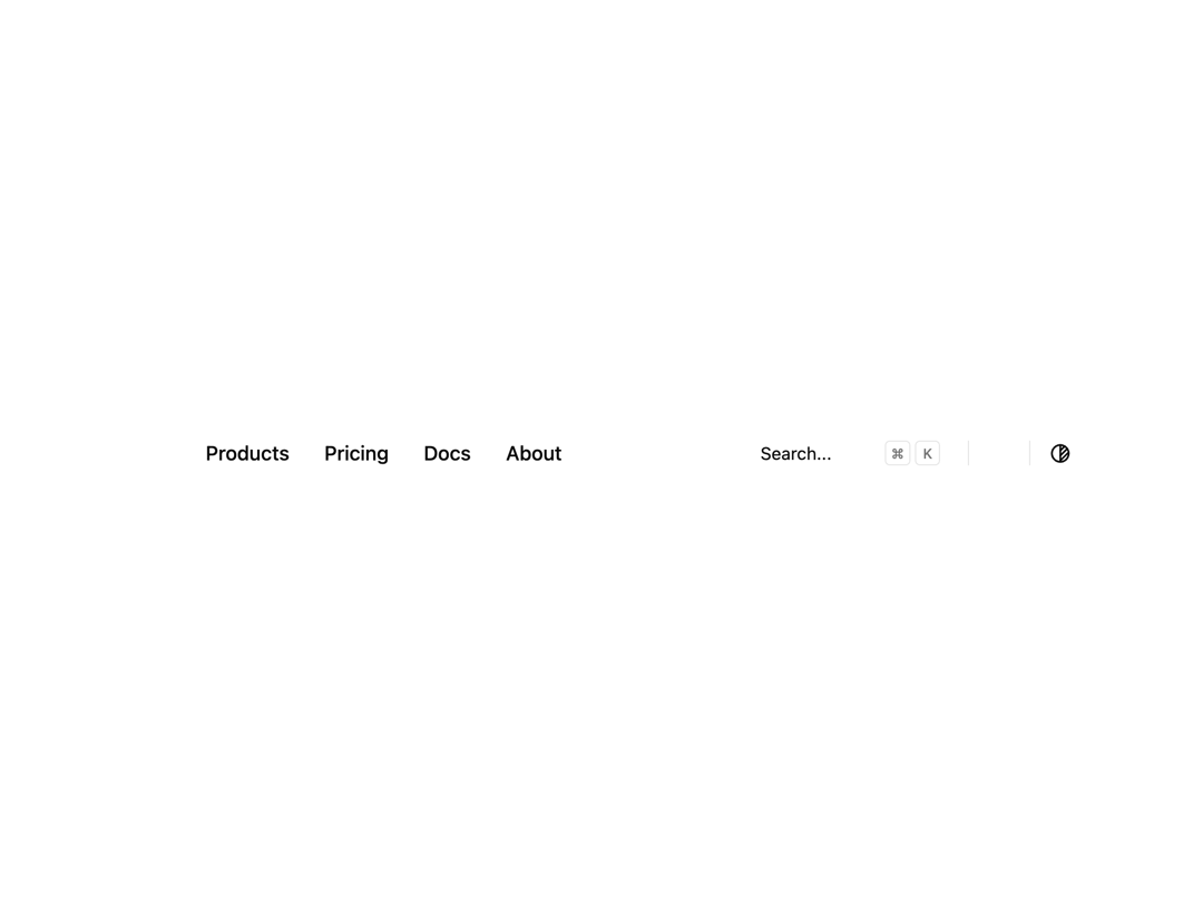
Here is Navbar Component
Built with React and Tailwind. Copy the prompt and paste it into Claude Code, Cursor or Lovable: your agent adds Navbar to your project and fits it to your theme.
Code
How Navbar is used: the demo's code. The component's own source comes with a free account.
Usage.tsx
import * as React from 'react'
import Link from 'next/link'
import { useTheme } from 'next-themes'
import { cn } from '@/lib/utils'
import { buttonVariants, Button } from '@/components/ui/button'
import {
  NavigationMenu,
  NavigationMenuItem,
  NavigationMenuLink,
  NavigationMenuList,
} from '@/components/ui/navigation-menu'
import { Separator } from '@/components/ui/separator'
import { MobileNav } from '@/components/ui/navbar'

/* ---------------------- Search Component ---------------------- */
function CommandMenuKbd({ className, ...props }: React.ComponentProps<'kbd'>) {
  return (
    <kbd
      className={cn(
        'bg-background text-muted-foreground pointer-events-none flex h-5 items-center justify-center gap-1 rounded border px-1 font-sans text-[0.7rem] font-medium select-none [&_svg:not([class*="size-"])]:size-3',
        className
      )}
      {...props}
    />
  )
}

export function Search({ className }: React.ComponentProps<'button'>) {
  const isMac = typeof window !== 'undefined' && navigator.platform.toUpperCase().includes('MAC')

  return (
    <Button
      variant="secondary"
      className={cn(
        'bg-surface text-surface-foreground/60 dark:bg-card relative h-8 w-full justify-start pl-2.5 font-normal shadow-none sm:pr-12 md:w-40 lg:w-56 xl:w-64',
        className
      )}
    >
      <span className="hidden lg:inline-flex">Search...</span>
      <span className="inline-flex lg:hidden">Search...</span>
      <div className="absolute top-1.5 right-1.5 hidden gap-1 sm:flex">
        <CommandMenuKbd>{isMac ? '⌘' : 'Ctrl'}</CommandMenuKbd>
        <CommandMenuKbd className="aspect-square">K</CommandMenuKbd>
      </div>
    </Button>
  )
}

/* ---------------------- Mode Switcher ---------------------- */
export function ModeSwitcher() {
  const { setTheme, resolvedTheme } = useTheme()

  const toggleTheme = React.useCallback(() => {
    setTheme(resolvedTheme === 'dark' ? 'light' : 'dark')
  }, [resolvedTheme, setTheme])

  return (
    <Button
      variant="ghost"
      size="icon"
      className="group/toggle extend-touch-target size-8 cursor-pointer"
      onClick={toggleTheme}
      title="Toggle theme"
    >
      <svg
        xmlns="http://www.w3.org/2000/svg"
        width="24"
        height="24"
        viewBox="0 0 24 24"
        fill="none"
        stroke="currentColor"
        strokeWidth="2"
        strokeLinecap="round"
        strokeLinejoin="round"
        className="size-4.5"
      >
        <path stroke="none" d="M0 0h24v24H0z" fill="none" />
        <path d="M12 12m-9 0a9 9 0 1 0 18 0a9 9 0 1 0 -18 0" />
        <path d="M12 3l0 18" />
        <path d="M12 9l4.65 -4.65" />
        <path d="M12 14.3l7.37 -7.37" />
        <path d="M12 19.6l8.85 -8.85" />
      </svg>
      <span className="sr-only">Toggle theme</span>
    </Button>
  )
}

/* ---------------------- Navbar ---------------------- */
const navigationLinks = [
  {
    name: 'Menu',
    items: [
      { href: '#', label: 'Products', active: true },
      { href: '#', label: 'Pricing' },
      { href: '#', label: 'Docs' },
      { href: '#', label: 'About' },
    ],
  },
]

export default function Navbar() {
  return (
    <header className="container mx-auto flex h-14 items-center justify-between gap-4">
      <div className="flex flex-1 items-center justify-start gap-2 md:gap-4">
        <MobileNav nav={navigationLinks} />

        <Link
          href="#"
          className={cn(
            buttonVariants({ variant: 'ghost', size: 'icon' }),
            'dark:hover:bg-accent text-accent-foreground [&_svg:not([class*="size-"])]:size-6'
          )}
        >
          {/* Logo SVG */}
          <svg
            viewBox="0 0 40 40"
            fill="none"
            xmlns="http://www.w3.org/2000/svg"
          >
            {/* paths */}
          </svg>
        </Link>

        <NavigationMenu className="max-md:hidden">
          <NavigationMenuList>
            {navigationLinks[0].items.map((link, index) => (
              <NavigationMenuItem key={index}>
                <NavigationMenuLink asChild>
                  <Link
                    href={link.href}
                    data-active={link.active}
                    className="rounded-md px-3 py-1.5 font-medium"
                  >
                    {link.label}
                  </Link>
                </NavigationMenuLink>
              </NavigationMenuItem>
            ))}
          </NavigationMenuList>
        </NavigationMenu>
      </div>

      <div className="flex items-center justify-end gap-2">
        <Search className="mr-2 hidden sm:flex" />

        <Separator
          orientation="vertical"
          className="hidden data-[orientation=vertical]:h-5 sm:flex"
        />

        <Link
          href="#"
          className={cn(
            buttonVariants({ variant: 'ghost', size: 'sm' }),
            'size-8 cursor-pointer'
          )}
        >
          {/* GitHub Icon */}
          <svg viewBox="0 0 438.549 438.549" fill="currentColor">
            {/* path */}
          </svg>
        </Link>

        <Separator
          orientation="vertical"
          className="data-[orientation=vertical]:h-5"
        />

        <ModeSwitcher />
      </div>
    </header>
  )
}
More in Navigation
View all

Sidebar
235
Navbar with Theme Toggle
43

Sidebar
339

Tabs
60
Numberless Pagination with Text
11
Oversized 404 Numeral
50
Footer
446
Pagination
43


