HomeBookmarks
Kokonut UIKokonut UI
Kokonut UI

Kokonut UI

100+ modern UI components built with Tailwind CSS, shadcn/ui, and Motion.

KUby Kokonut UI
60components14.4Mviews33.6Kbookmarks

Kokonut UI contents
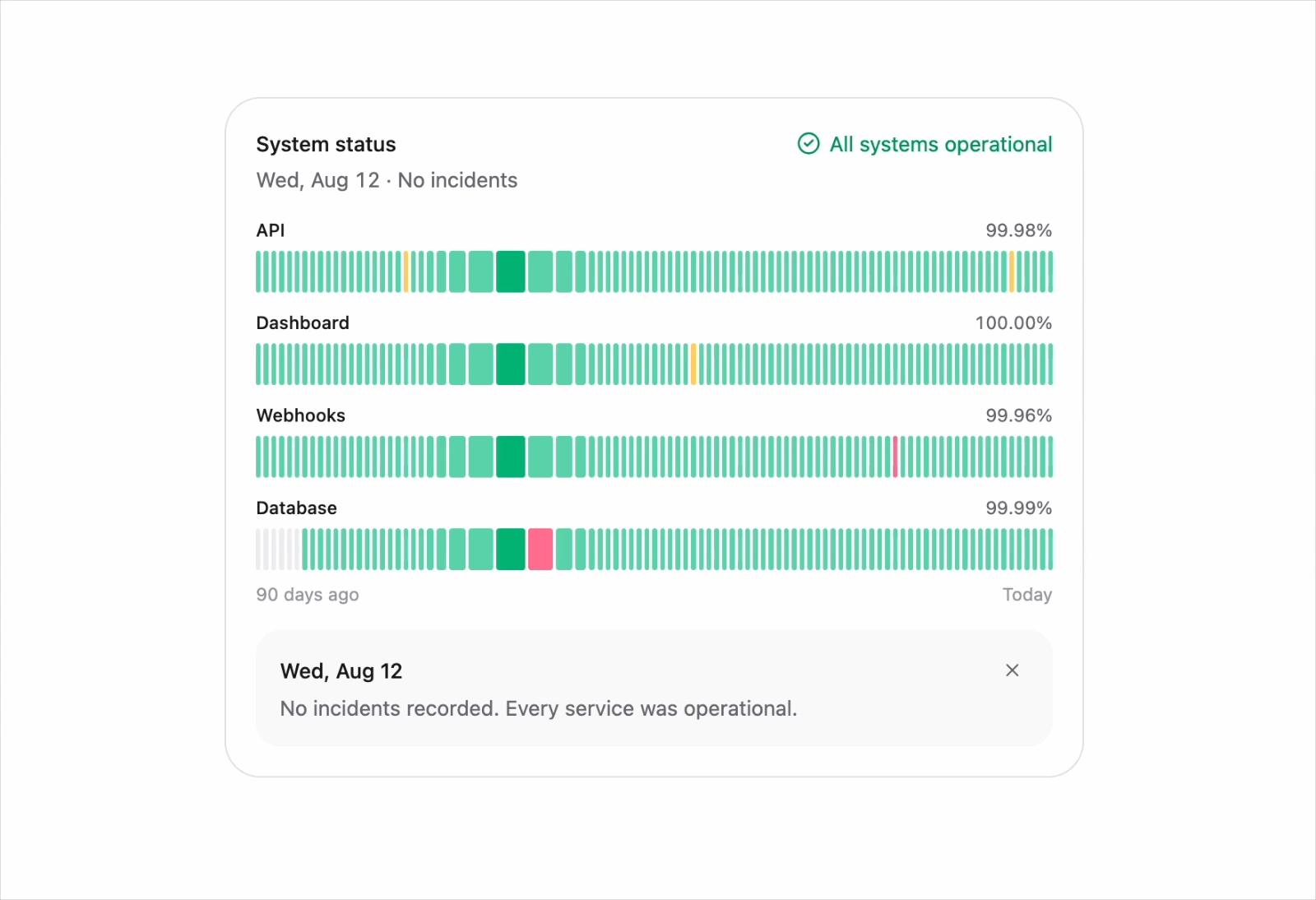
  • Uptime Card

    Uptime Card

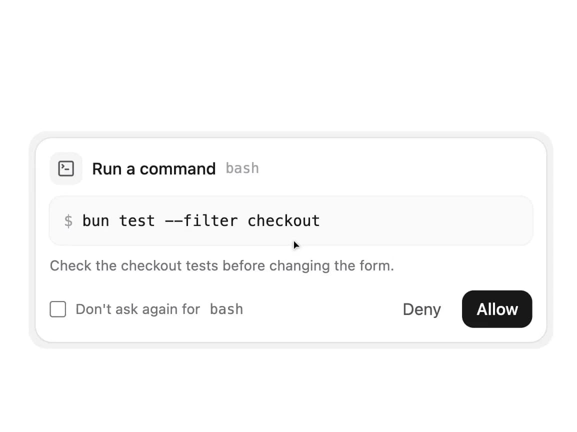
  • AI Tool Approval

    AI Tool Approval

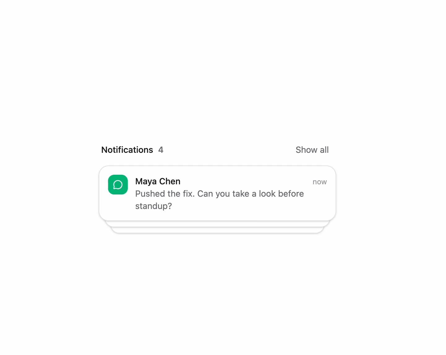
  • Notification Stack

    Notification Stack

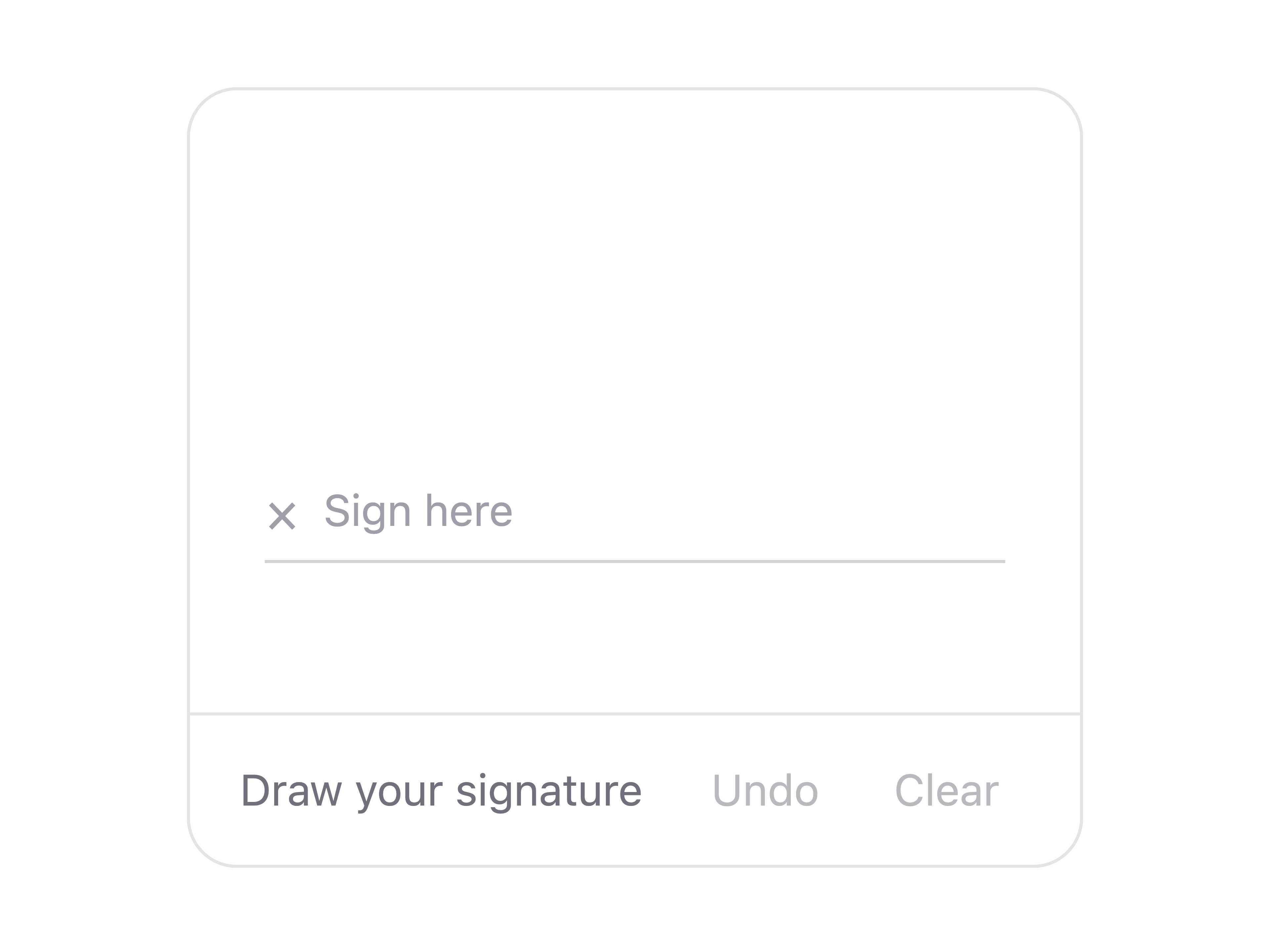
  • Signature Pad

    Signature Pad

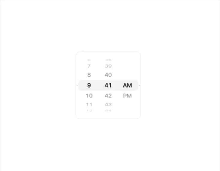
  • Wheel Picker

    Wheel Picker

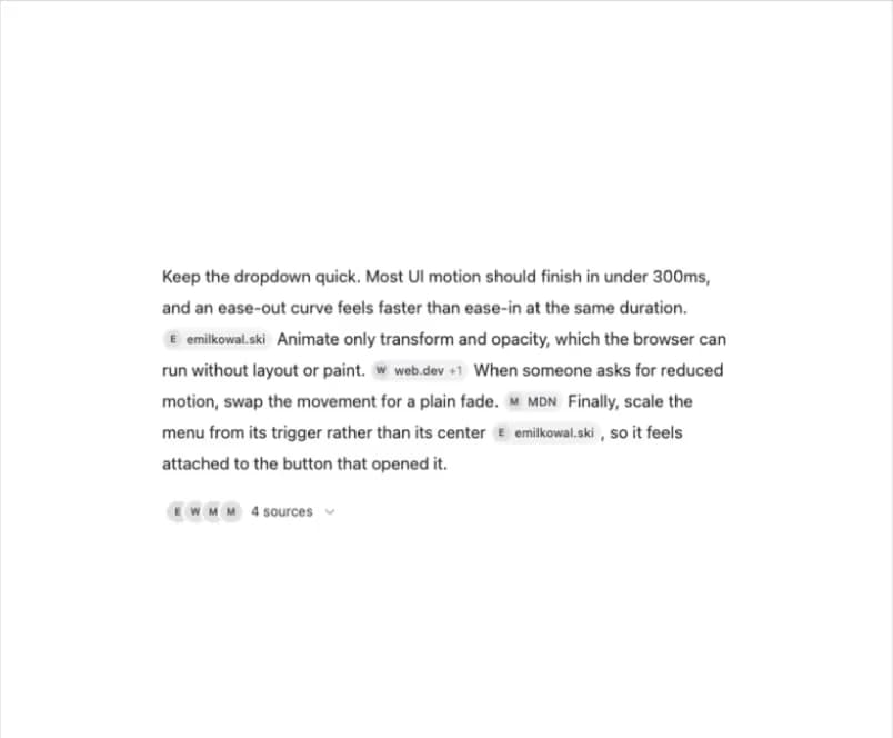
  • AI Citations

    AI Citations

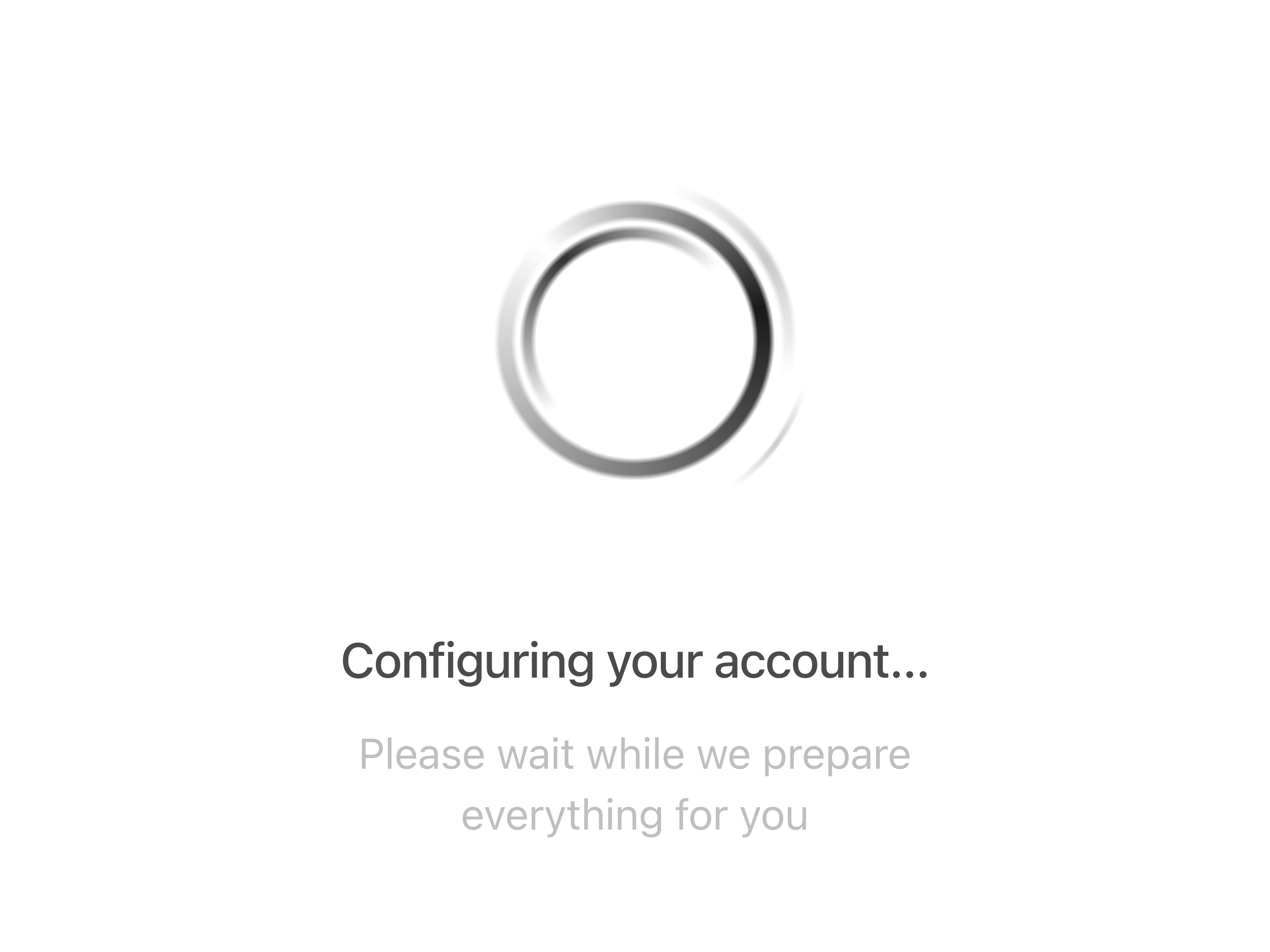
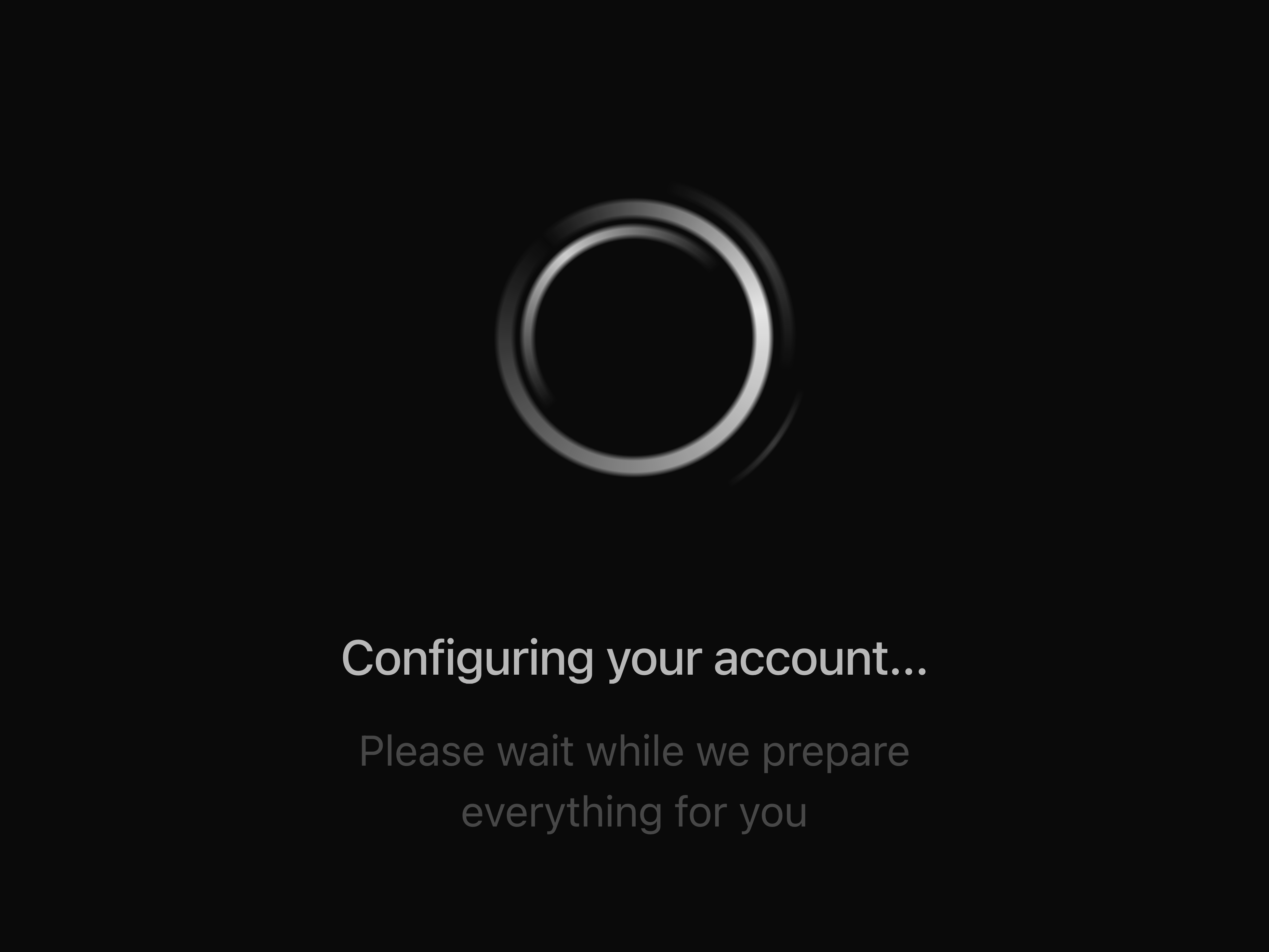
  • LoaderLoader

    Loader

  • Smooth Drawer

    Smooth Drawer

  • Carousel Cards

    Carousel Cards

  • AI Loading State

    AI Loading State

  • AI Text Loading

    AI Text Loading

  • Glitch Text

    Glitch Text

  • Swoosh Text

    Swoosh Text

  • Typewriter

    Typewriter

  • Sliced Text

    Sliced Text

  • Profile Dropdown

    Profile Dropdown

  • Apple Activity Ring

    Apple Activity Ring

  • Animated AI Input

    Animated AI Input

  • Minimalist Hero Fashion

    Minimalist Hero Fashion

  • Avatar PickerAvatar Picker

    Avatar Picker

  • Matrix Text

    Matrix Text

  • Beams Background

    Beams Background

  • V0 AI ChatV0 AI Chat

    V0 AI Chat

  • Background Paths

    Background Paths

    1. Components
    2. /
    3. Kokonut UI
    4. /
    5. Kokonut UI

    Related libraries

    Magic UI

    Magic UI

    by Dillion Verma

    64

    components

    ReUI

    ReUI

    by Sean Hello

    262

    components

    Origin UI

    Origin UI

    by Origin UI

    44

    components

    cult ui

    cult ui

    by cult/ui

    50

    components

    Ruixen UI

    Ruixen UI

    by Ruixen UI

    347

    components

    HextaUI

    HextaUI

    by Preet Suthar

    119

    components

    About Kokonut UI

    This page collects the Kokonut UI components published on 21st by Dorian Baffier — modern React components and blocks built with Tailwind CSS, with motion where it earns its place. The collection covers polished interface pieces you can preview live here, from cards and buttons to fuller sections.

    Compare everything in one place, then copy the TSX, install through the shadcn CLI, or pull a component into Cursor or Claude Code over MCP. The components follow shadcn/ui conventions, so they drop into a Tailwind Next.js project cleanly.

    All 60 Kokonut UI components

    • Action Search Bar
    • Activity Card
    • AI Citations
    • AI Input
    • AI Input With File
    • AI Input With Loading
    • AI Input With Search
    • AI Input with Suggestions
    • AI Loading State
    • AI Text Loading
    • AI Tool Approval
    • AI Voice Input

    Frequently asked questions

    Browse by category

    Card1780Button2043Animated16Hero1152

    Browse all component libraries →

  • Animated AI Input
  • Apple Activity Ring
  • Avatar Picker
  • Background Circles
  • Background Paths
  • Beams Background
  • Bento Grid
  • Button Colorful with Hover Effect
  • Button Shiny
  • Carousel Cards
  • Chat Card
  • Color Input
  • FAQ
  • FAQ with Categories
  • Glitch Text
  • Hand Writing Text
  • Hold and Release Button
  • Interactive Checkout
  • Loader
  • Magnetize Button
  • Matrix Text
  • Minimalist Hero Fashion
  • Modal Pricing
  • Notification Stack
  • Numeric Input
  • Particle Button
  • Password Input
  • Pricing Cards
  • Pricing Table
  • Profile Dropdown
  • Shape Landing Hero
  • Signature Pad
  • Sliced Text
  • Smooth Drawer
  • Social Card
  • Swoosh Text
  • Tag Input
  • Team Invitation
  • Text Rewind
  • Typewriter
  • Uptime Card
  • useAutoResizeTextarea
  • useFileInput
  • useTags
  • v0 AI Chat
  • Wave Text
  • Wheel Picker
  • X Gradient Card