About
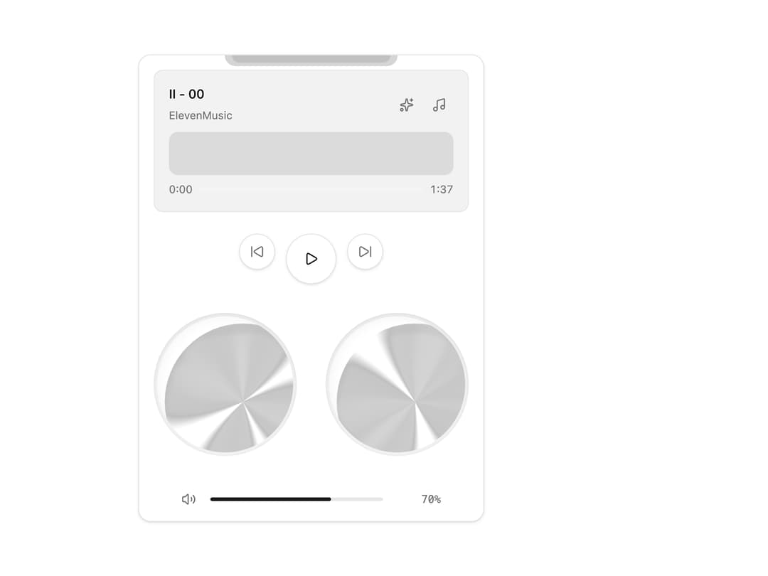
A retro boombox-style audio player card with dual animated orb "speakers" that react to playback, a scrubbable waveform, playlist, volume slider and an ambience/reverb toggle.
Built with React and Tailwind. Copy the prompt and paste it into Claude Code, Cursor or Lovable: your agent adds Speaker to your project and fits it to your theme.
Code
How Speaker is used: the demo's code. The component's own source comes with a free account.
Usage.tsx
import Speaker from "@/components/ui/speaker-01";

export default function SpeakerDemo() {
  return (
    <div className="flex w-full min-h-screen items-center justify-center bg-background p-8">
      <Speaker className="w-full max-w-sm" />
    </div>
  );
}
Dependencies
More by ElevenLabs
View all
Orb
223
Bar Visualizer
121
Waveform
94
Shimmering Text
90
Audio Player
53
Voice Picker
46
Live Waveform
44
Response
35