

About
Here is Checkbox Group component
Built with React and Tailwind. Copy the prompt and paste it into Claude Code, Cursor or Lovable: your agent adds Checkbox Group to your project and fits it to your theme.
Code
How Checkbox Group is used: the demo's code. The component's own source comes with a free account.
Usage.tsx
import Component from "@/components/ui/checkbox-group-1";

export default function CheckboxGroupHorizontal() {
  return (
    <div className="max-w-2xl rounded-lg p-4 ring-1 bg-white text-gray-900 ring-gray-200 dark:bg-gray-800 dark:text-gray-100 dark:ring-gray-700">
      <Component
        label="Notifications"
        helpText="Select at least one channel"
        horizontal
        error
      >
        <label className="flex items-center gap-2">
          <input type="checkbox" className="h-4 w-4 accent-indigo-600" />
          <span>Email</span>
        </label>
        <label className="flex items-center gap-2">
          <input type="checkbox" className="h-4 w-4 accent-indigo-600" defaultChecked />
          <span>Push</span>
        </label>
        <label className="flex items-center gap-2">
          <input type="checkbox" className="h-4 w-4 accent-indigo-600" />
          <span>SMS</span>
        </label>
      </Component>
    </div>
  );
}
More by SubframeApp
View all

Area Chart
108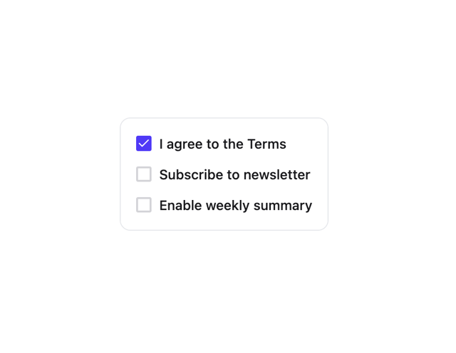
Checkbox
16
Checkbox Card
14
Breadcrumb
12
Calendar
6
Context Menu
4
Accordion
3
Avatar
2
More in Forms
View all

Premium Auth
500

Login 2
7
Authentication Card
47

Login 1
52

Contact Card
1K
Login Form
6

Form
16

Book A Demo 3
83
