
About
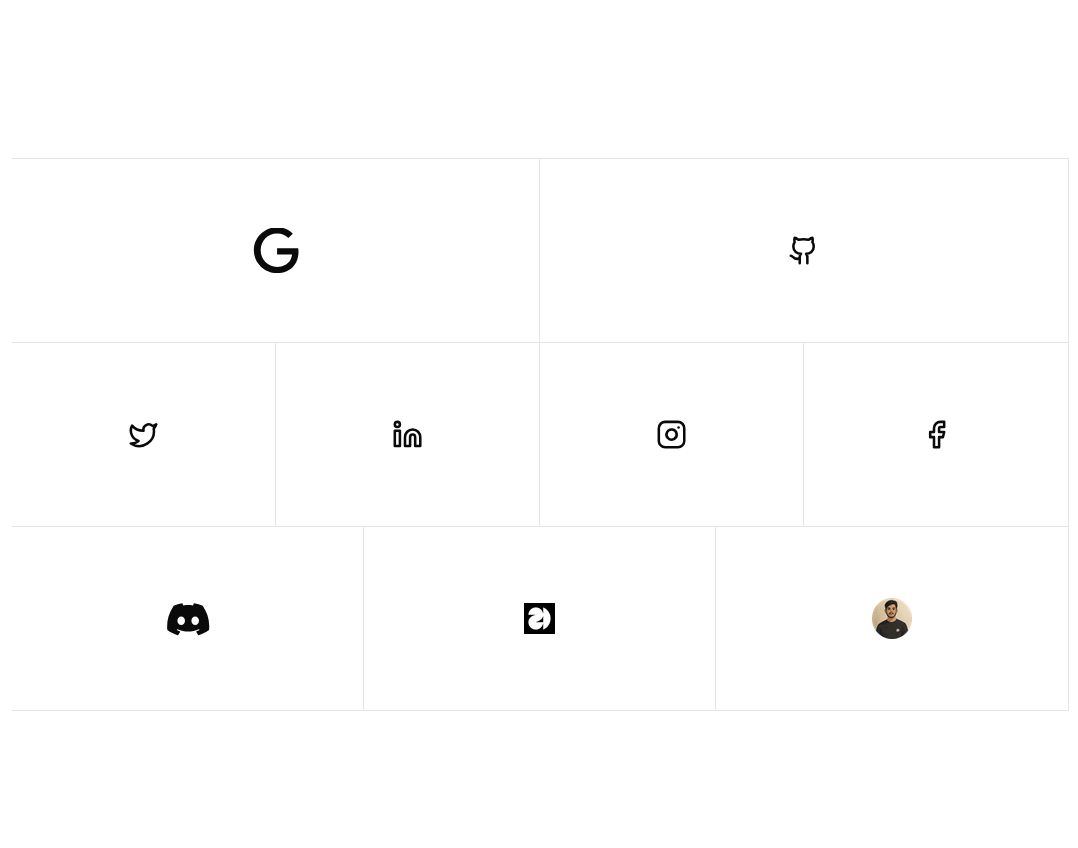
The LinkBox component displays either an icon or image inside a styled grid item. On hover, it animates a dark overlay from the nearest edge using clip-path with Framer Motion. It's used for linking to external platforms and opens the target URL in a new tab
Built with React and Tailwind. Copy the prompt and paste it into Claude Code, Cursor or Lovable: your agent adds Clip Path Links to your project and fits it to your theme.
Code
How Clip Path Links is used: the demo's code. The component's own source comes with a free account.
Usage.tsx
import React from "react";
import { ClipPathLinks } from "./components/ui/clip-path-links";

const Demo: React.FC = () => {
  return (
    <div className="min-h-screen flex items-center justify-center px-4 py-12">
      <div className="w-full max-w-7xl">
        <ClipPathLinks />
      </div>
    </div>
  );
};

export default Demo;
Dependencies
More by Tom Is Loading
View all
Kanban
389
Reveal links
194
Vertical accordion
184
Squishy card
40