

About
A keyboard-accessible accordion built on native HTML5 details/summary elements, with single- or multi-expand coordination, focus-visible outlines and reduced-motion support — ported to React from A11YPros' a11y-ui web component (credit: Ryan Mack / a11ypros.com).
Built with React and Tailwind. Copy the prompt and paste it into Claude Code, Cursor or Lovable: your agent adds Accessible Accordion to your project and fits it to your theme.
Code
How Accessible Accordion is used: the demo's code. The component's own source comes with a free account.
Usage.tsx
import { Accordion, AccordionItem } from "@/components/ui/a11y-accordion";

export default function AccordionWithDefaultOpenDemo() {
  return (
    <div className="w-full max-w-xl mx-auto p-6">
      <Accordion>
        <AccordionItem id="item-1" title="Getting Started" defaultOpen>
          <p>
            This section is open by default. Click the header to collapse it.
          </p>
        </AccordionItem>
        <AccordionItem id="item-2" title="Installation">
          <p>Install the package using npm, yarn, or pnpm.</p>
        </AccordionItem>
        <AccordionItem id="item-3" title="Configuration">
          <p>Configure the component according to your needs.</p>
        </AccordionItem>
      </Accordion>
    </div>
  );
}
More by a11ypros
View all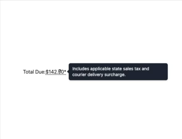
Accessible Tooltip
1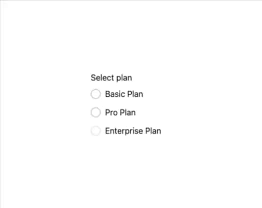
Accessible Radio Group
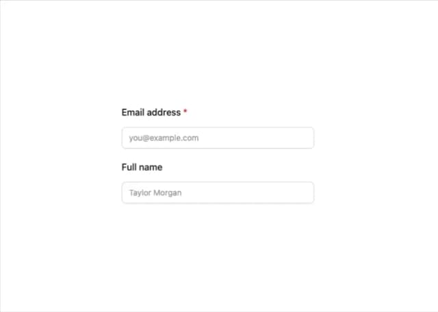
A11y Label