
About
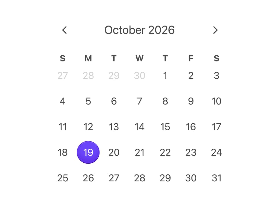
A date picker calendar grid with month navigation for selecting a single date, styled with plain CSS (no Tailwind) using custom properties for theming.
Built with React and Tailwind. Copy the prompt and paste it into Claude Code, Cursor or Lovable: your agent adds Calendar to your project and fits it to your theme.
Code
How Calendar is used: the demo's code. The component's own source comes with a free account.
Usage.tsx
import { Calendar } from "@/components/ui/css-calendar";
import { today, getLocalTimeZone } from "@internationalized/date";

export default function CalendarDemo() {
  return (
    <Calendar
      aria-label="Appointment date"
      defaultValue={today(getLocalTimeZone())}
    />
  );
}
Dependencies
More by py_ets
View all
Alert Dialog
9
React Aria CheckboxGroup
8
Command Palette
6
React Aria DatePicker
5
Progress Bar
5
React Aria Tree
4
React Aria ColorArea
4
React Aria Switch
3