
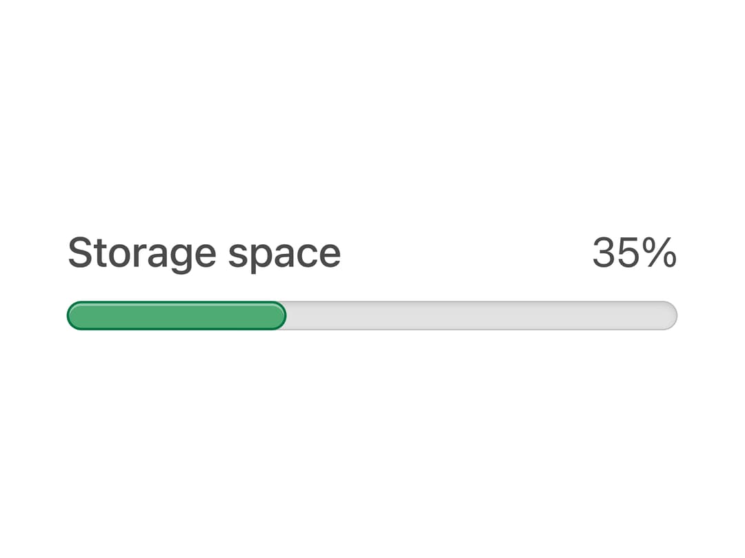
About
A labeled progress meter bar that shows a percentage value with color that shifts from green to orange to red as it approaches capacity, useful for storage quotas or usage limits.
Built with React and Tailwind. Copy the prompt and paste it into Claude Code, Cursor or Lovable: your agent adds Meter to your project and fits it to your theme.
Code
How Meter is used: the demo's code. The component's own source comes with a free account.
Usage.tsx
import { Meter } from "@/components/ui/css-meter";

export default function MeterDemo() {
  return (
    <div className="flex items-center justify-center w-full h-full p-10">
      <Meter label="Storage space" value={35} />
    </div>
  );
}
Dependencies
More by py_ets
View all
Alert Dialog
9
React Aria CheckboxGroup
8
Command Palette
6
React Aria DatePicker
5
Progress Bar
5
React Aria Tree
4
React Aria ColorArea
4
React Aria Switch
3