
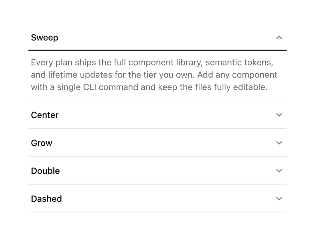
About
A collapsible section whose trigger reveals its content while an animated underline sweeps, centers, grows, doubles, or dashes in beneath the label, with five visual variants and four sizes.
Built with React and Tailwind. Copy the prompt and paste it into Claude Code, Cursor or Lovable: your agent adds Underline Collapsible to your project and fits it to your theme.
Code
How Underline Collapsible is used: the demo's code. The component's own source comes with a free account.
Usage.tsx
import {
  SweepCollapsible,
  CenterCollapsible,
  GrowCollapsible,
  DoubleCollapsible,
  DashedCollapsible,
} from "@/components/ui/collapsible-underline";

export default function CollapsibleUnderlineDemo() {
  return (
    <div className="mx-auto flex w-full max-w-md flex-col divide-y divide-border/50 px-4">
      <SweepCollapsible defaultOpen title="Sweep" />
      <CenterCollapsible title="Center" />
      <GrowCollapsible title="Grow" />
      <DoubleCollapsible title="Double" />
      <DashedCollapsible title="Dashed" />
    </div>
  );
}
Dependencies
More by ai 2
View all
Ripple Buttons
31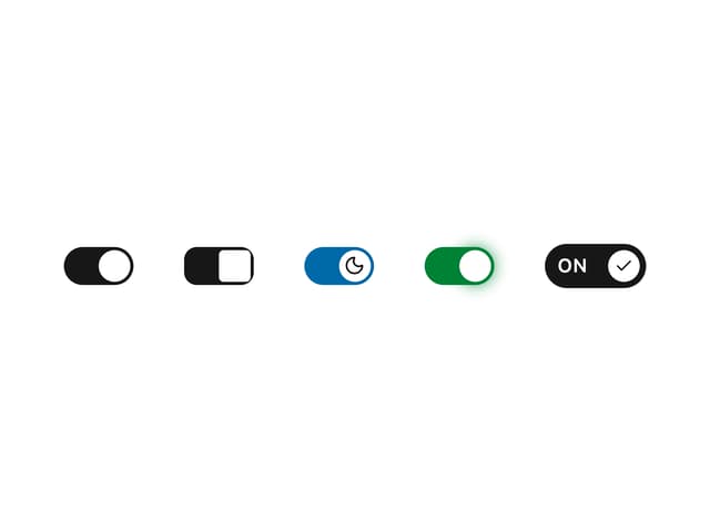
Styled Toggle Switches
14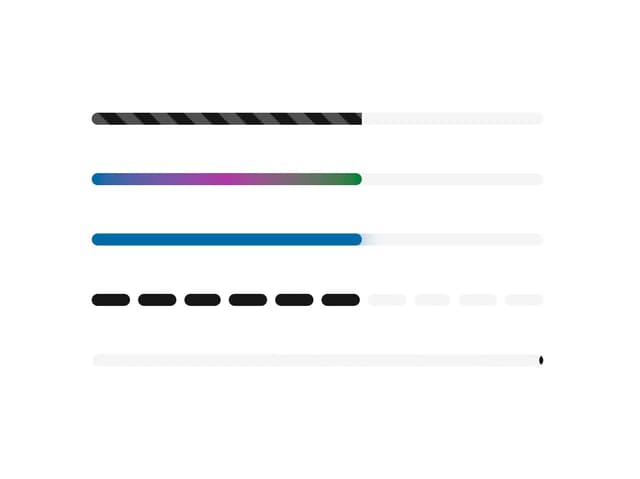
Styled Progress Bars
14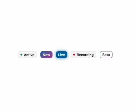
Styled Badges
10
OTP Pin Input
8
Particle Toggles
7
Input Group Glass
6
File Input
6