
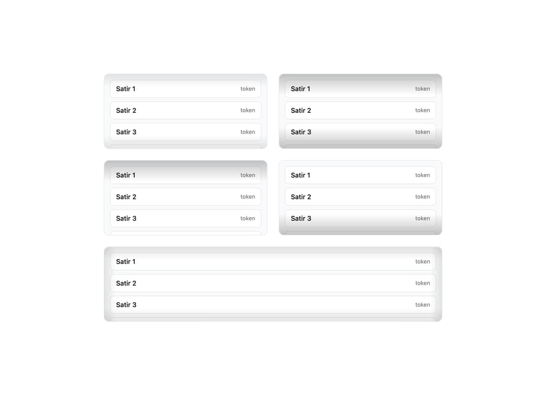
About
A scrollable container with a soft inner-shadow gradient at its edges to visually signal that content overflows and can be scrolled, available in soft, deep, top, bottom and frame edge variants.
Built with React and Tailwind. Copy the prompt and paste it into Claude Code, Cursor or Lovable: your agent adds Inset Scroll Area to your project and fits it to your theme.
Code
How Inset Scroll Area is used: the demo's code. The component's own source comes with a free account.
Usage.tsx
import ScrollAreaInset, {
  DeepInsetScrollArea,
  TopInsetScrollArea,
  BottomInsetScrollArea,
  FrameInsetScrollArea,
} from "@/components/ui/scroll-area-inset";

export default function ScrollAreaInsetDemo() {
  return (
    <div className="grid w-full max-w-3xl grid-cols-1 gap-6 p-6 sm:grid-cols-2">
      <ScrollAreaInset size="sm" />
      <DeepInsetScrollArea size="sm" />
      <TopInsetScrollArea size="sm" />
      <BottomInsetScrollArea size="sm" />
      <FrameInsetScrollArea size="sm" className="sm:col-span-2" />
    </div>
  );
}
More by ai 2
View all
Ripple Buttons
31
Styled Toggle Switches
14
Styled Progress Bars
14
Styled Badges
10
OTP Pin Input
8
Particle Toggles
7
Input Group Glass
6
File Input
6