
About
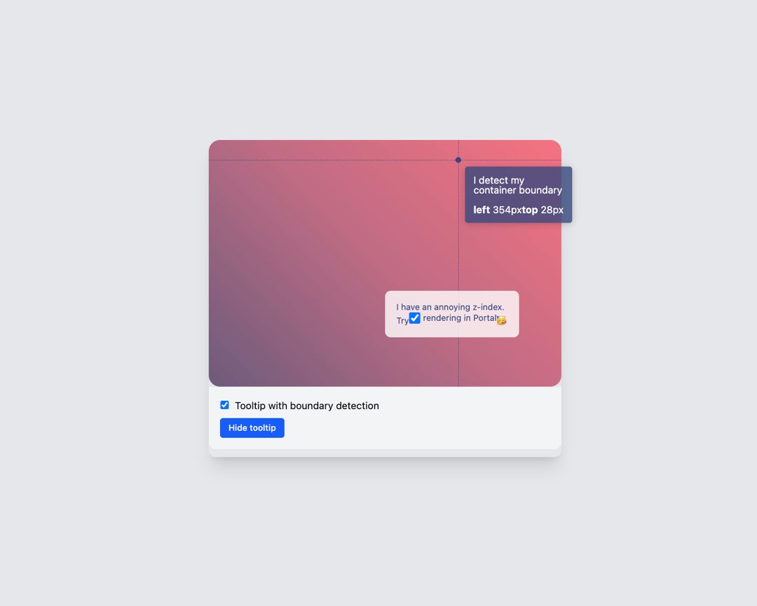
Here is tooltip component
Built with React and Tailwind. Copy the prompt and paste it into Claude Code, Cursor or Lovable: your agent adds Tooltip to your project and fits it to your theme.
Code
How Tooltip is used: the demo's code. The component's own source comes with a free account.
Usage.tsx
// src/DemoOne.tsx (or your demo file path)

import React from 'react';
import { Component as TooltipExampleComponent } from '@/components/ui/tooltip';
import { cn } from "@/lib/utils";

const DemoOne = () => {
  return (
    <div className={cn("flex w-full min-h-screen justify-center items-center p-4 bg-gray-200")}>
      <div className="rounded-lg shadow-xl overflow-hidden w-[500px] h-[450px] flex flex-col">

        <div className="flex-grow">
          <TooltipExampleComponent
            width={500}
            height={350}
            showControls={true}
          />
        </div>
      </div>
    </div>
  );
};

export { DemoOne };
Dependencies
More by Airbnb
View all
Radar chart
104
Heatmaps
102
Pie chart
99
Linktypes
95
Finance Chart
83
Word cloud
62
Streamgraph
51
Legends
44