
About
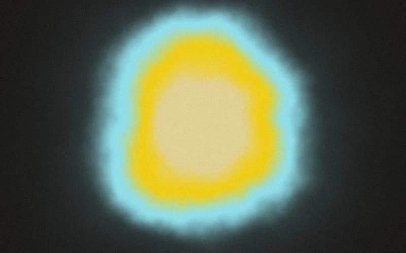
Animated WebGL shader background in the Orb style. Generated by the 21st.dev Shader Builder. 4-color palette (#23211F, #97E4F0, #F5D41E, #E6D79B). Features: cursor-reactive (spotlight). A drop-in, zero-dependency React component for hero sections and animated gradient/noise backgrounds.
Built with React and Tailwind. Copy the prompt and paste it into Claude Code, Cursor or Lovable: your agent adds Orb shader to your project and fits it to your theme.
Code
How Orb shader is used: the demo's code. The component's own source comes with a free account.
Usage.tsx
import { ShaderBackground } from "@/components/ui/orb-shader"

export default function ShaderBackgroundDemo() {
  return (
    <div className="relative h-screen w-full overflow-hidden">
      <ShaderBackground className="h-full w-full" />
    </div>
  )
}
More in Heroes
View all

SaaS Template
2.4K
Centered Hero with Image Fan
924

Hero
1.2K

Responsive Hero Banner
2K

Hero Section 6
881
Hero Golden Spiral
101

Home Section
65

Minimalist Hero Fashion
284
