
About
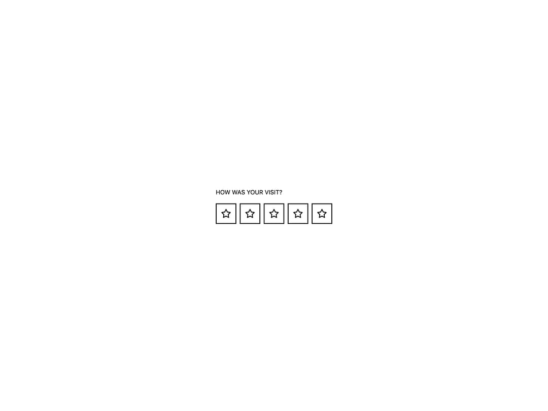
A star, heart, or smiley icon rating input rendered as an accessible radio group, with optional read-only, disabled, and clear-to-zero states.
Built with React and Tailwind. Copy the prompt and paste it into Claude Code, Cursor or Lovable: your agent adds Rating to your project and fits it to your theme.
Code
How Rating is used: the demo's code. The component's own source comes with a free account.
Usage.tsx
import Rating from "@/components/ui/rating";

import { useState } from "react";

export default function RatingDemo() {
  const [value, setValue] = useState(0);

  return (
    <div className="eink-theme flex min-h-[320px] w-full items-center justify-center p-10">
      <Rating value={value} onChange={setValue} max={5}>
        How was your visit?
      </Rating>
    </div>
  );
}
More by alexisroe
View all
E-Ink Progress Bar
Navigation
Pill
Notification
Number Stepper
Log
Value Display
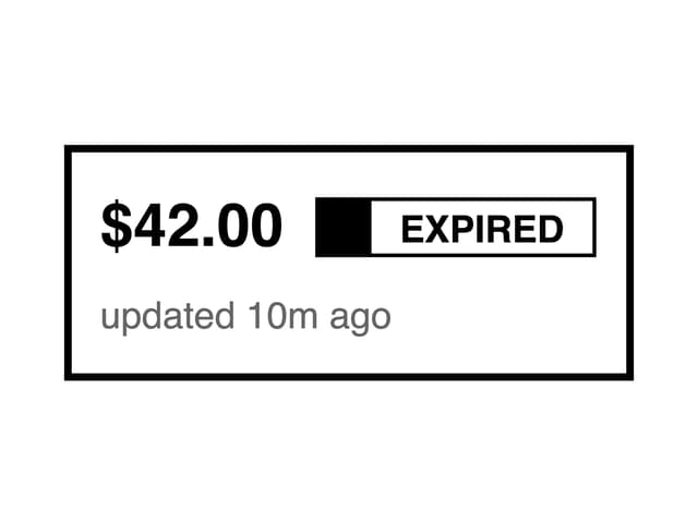
Last Updated
More in Buttons
View all

Button
14
Texture Button
92
Button
34
Button Save
46

Button
64

Button Group
3

Notification Button
103

Button

