
About
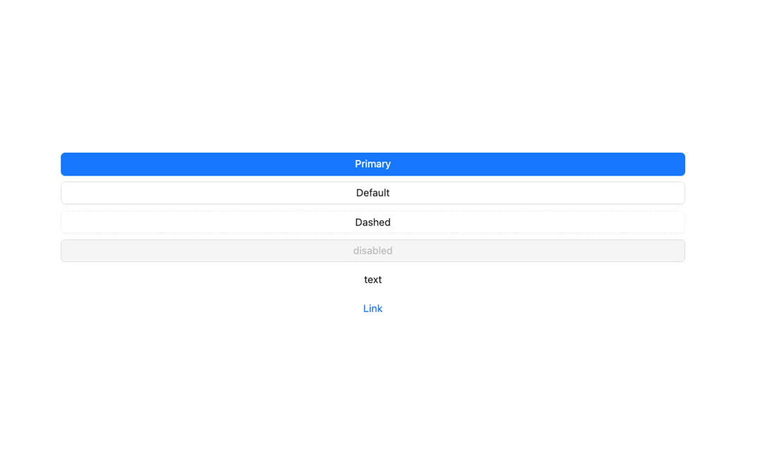
Here is Button Ant component
Built with React and Tailwind. Copy the prompt and paste it into Claude Code, Cursor or Lovable: your agent adds Button Ant to your project and fits it to your theme.
Code
How Button Ant is used: the demo's code. The component's own source comes with a free account.
Usage.tsx
import React from 'react';
import { Button, Flex } from 'antd';

const App: React.FC = () => (
  <Flex vertical gap="small" style={{ width: '100%' }}>
    <Button type="primary" block>
      Primary
    </Button>
    <Button block>Default</Button>
    <Button type="dashed" block>
      Dashed
    </Button>
    <Button disabled block>
      disabled
    </Button>
    <Button type="text" block>
      text
    </Button>
    <Button type="link" block>
      Link
    </Button>
  </Flex>
);

export default App;
Dependencies
More by antdesign
View all
Menu
22
Pagination Ant
16
Dropdown
15
Breadcrumb
10
FloatButton
7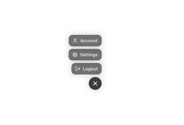
Floating Action Menu
More in Buttons
View all
Button Save
46

Button
20

Eclipse Button
5

Button
6

Button
14

Button Group
37

Button
32
Split Button
32

