
About
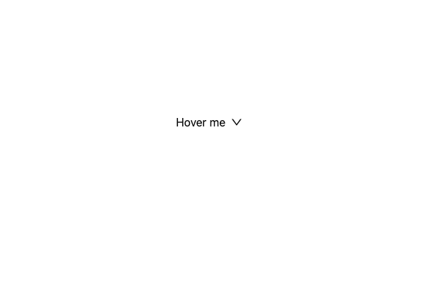
Here is Dropdown component
Built with React and Tailwind. Copy the prompt and paste it into Claude Code, Cursor or Lovable: your agent adds Dropdown to your project and fits it to your theme.
Code
How Dropdown is used: the demo's code. The component's own source comes with a free account.
Usage.tsx
import React from 'react';
import { DownOutlined, SettingOutlined } from '@ant-design/icons';
import type { MenuProps } from 'antd';
import { Dropdown, Space } from 'antd';

const items: MenuProps['items'] = [
  {
    key: '1',
    label: 'My Account',
    disabled: true,
  },
  {
    type: 'divider',
  },
  {
    key: '2',
    label: 'Profile',
    extra: '⌘P',
  },
  {
    key: '3',
    label: 'Billing',
    extra: '⌘B',
  },
  {
    key: '4',
    label: 'Settings',
    icon: <SettingOutlined />,
    extra: '⌘S',
  },
];

const App: React.FC = () => (
  <Dropdown menu={{ items }}>
    <a onClick={(e) => e.preventDefault()}>
      <Space>
        Hover me
        <DownOutlined />
      </Space>
    </a>
  </Dropdown>
);

export default App;
Dependencies
More by antdesign
View all
Menu
22
Pagination Ant
16
Breadcrumb
10
FloatButton
7
Button Ant
5
Floating Action Menu