
About
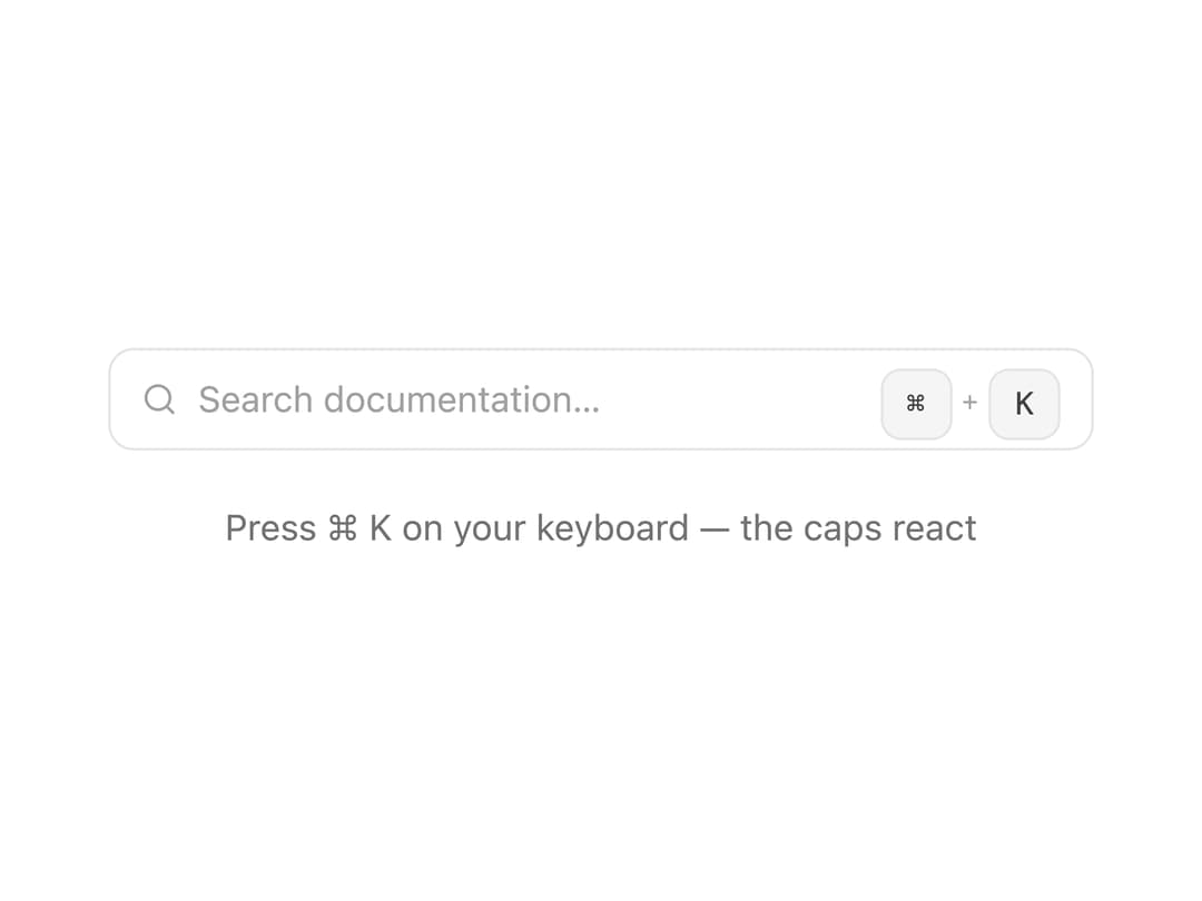
A 3D keycap component that visually depresses when its matching keyboard key is pressed, and can chain into combo shortcuts (like ⌘K) that pulse and fire a callback when every key is held at once.
Built with React and Tailwind. Copy the prompt and paste it into Claude Code, Cursor or Lovable: your agent adds Kbd Key to your project and fits it to your theme.
Code
How Kbd Key is used: the demo's code. The component's own source comes with a free account.
Usage.tsx
"use client";

import { KbdCombo } from "@/components/ui/kbd-key";
import React from "react";
import { motion, useAnimationControls } from "framer-motion";

export default function KbdKeyDemo() {
  const controls = useAnimationControls();

  const handleTrigger = () => {
    controls.start({
      boxShadow: [
        "0 0 0 0px rgba(163, 163, 163, 0)",
        "0 0 0 4px rgba(163, 163, 163, 0.45)",
        "0 0 0 0px rgba(163, 163, 163, 0)",
      ],
      transition: { duration: 0.6, ease: "easeOut" },
    });
  };

  return (
    <div className="flex w-full flex-col items-center gap-5 py-10">
      <motion.div
        animate={controls}
        className="flex h-10 w-full max-w-sm items-center justify-between gap-3 rounded-lg border border-neutral-200 bg-white px-3 dark:border-neutral-700 dark:bg-neutral-900"
      >
        <span className="flex items-center gap-2 text-sm text-neutral-400">
          <svg
            width="14"
            height="14"
            viewBox="0 0 24 24"
            fill="none"
            stroke="currentColor"
            strokeWidth="2"
            strokeLinecap="round"
            strokeLinejoin="round"
            aria-hidden="true"
          >
            <circle cx="11" cy="11" r="8" />
            <path d="m21 21-4.3-4.3" />
          </svg>
          Search documentation…
        </span>
        <KbdCombo keys="meta+k" onTrigger={handleTrigger} />
      </motion.div>
      <p className="text-sm text-neutral-500 dark:text-neutral-400">
        Press ⌘ K on your keyboard — the caps react
      </p>
    </div>
  );
}
Dependencies
More by Arihant jain
View all
Footer section
1.9K
Multistep Form
696
Animated Drawer
684
Status Badge
492
Stacked Circular Footer
411
Input Modal
312
Large Name Footer
193
Profile Dropdown
186