
About
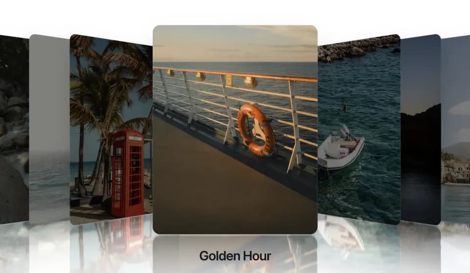
3D Cover Flow carousel with spring physics. Drag, scroll or click to navigate; optional reflection and a WebAudio detent tick per item. One file, motion only. Free at useplanes.com/components/carousels — npx shadcn add https://useplanes.com/r/cover-flow.json
Built with React and Tailwind. Copy the prompt and paste it into Claude Code, Cursor or Lovable: your agent adds Cover Flow to your project and fits it to your theme.
Code
How Cover Flow is used: the demo's code. The component's own source comes with a free account.
Usage.tsx
"use client";

import { CoverFlow, type CoverFlowItem } from "@/components/ui/cover-flow";

const IMG = "https://useplanes.com/images";

const ITEMS: CoverFlowItem[] = [
  { id: 1, image: `${IMG}/1.webp`, title: "Ferris Wheel" },
  { id: 2, image: `${IMG}/2.webp`, title: "Stingrays" },
  { id: 3, image: `${IMG}/3.webp`, title: "Forest Stream" },
  { id: 4, image: `${IMG}/4.webp`, title: "Kitesurfer" },
  { id: 5, image: `${IMG}/5.webp`, title: "Phone Booth" },
  { id: 6, image: `${IMG}/6.webp`, title: "Golden Hour" },
  { id: 7, image: `${IMG}/7.webp`, title: "The Cove" },
  { id: 8, image: `${IMG}/8.webp`, title: "Sunset Cliff" },
  { id: 9, image: `${IMG}/9.webp`, title: "Seaside Town" },
  { id: 10, image: `${IMG}/10.webp`, title: "Lighthouse" },
  { id: 11, image: `${IMG}/11.webp`, title: "Open Water" },
];

export default function CoverFlowDemo() {
  return (
    <div className="h-[520px] w-full">
      <CoverFlow
        items={ITEMS}
        itemWidth={300}
        itemHeight={380}
        centerGap={230}
        stackSpacing={80}
        enableReflection
        enableAudio
        initialIndex={5}
      />
    </div>
  );
}