
About
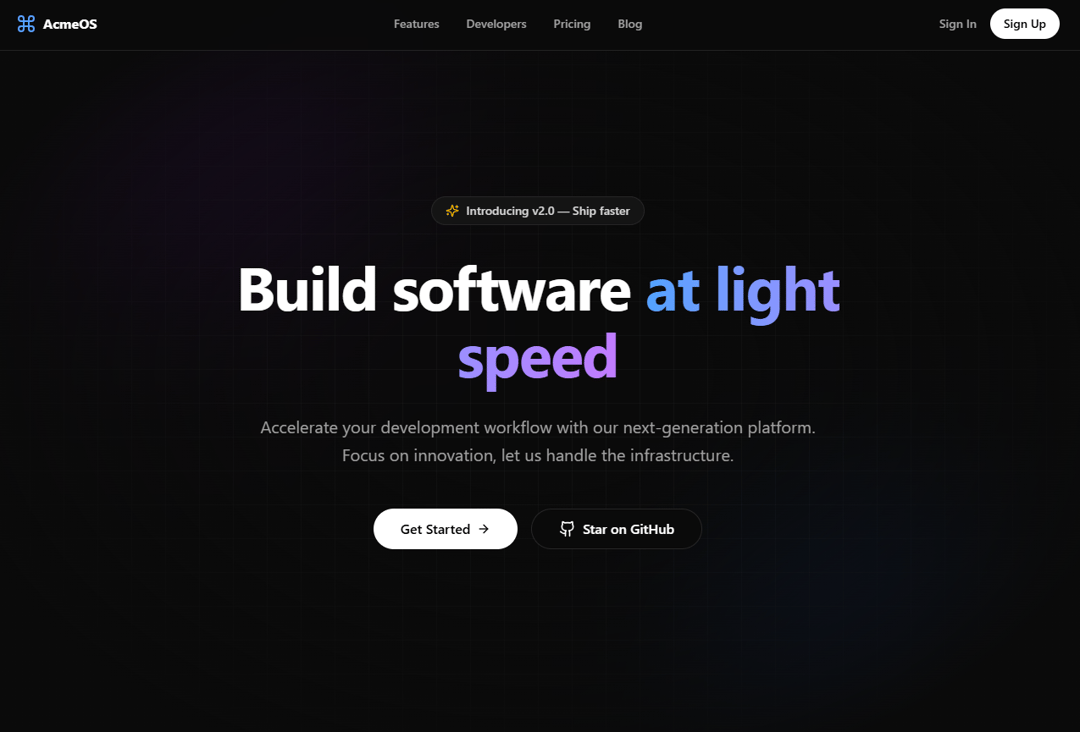
A visually stunning hero section for modern SaaS websites. Features an animated, glowing aurora background effect combined with a technical grid pattern and a frosted glass badge.
Built with React and Tailwind. Copy the prompt and paste it into Claude Code, Cursor or Lovable: your agent adds Aurora Hero Section to your project and fits it to your theme.
Code
How Aurora Hero Section is used: the demo's code. The component's own source comes with a free account.
Usage.tsx
import { AuroraHero } from "@/components/ui/aurora-hero-section";
import { Command } from "lucide-react";

export default function DemoAuroraHero() {
  return (
    <div className="w-full min-h-screen bg-neutral-950 relative">

      {/* Simulation of a fixed navigation header for context */}
      <header className="fixed top-0 left-0 right-0 z-50 flex h-16 items-center justify-between border-b border-white/10 bg-neutral-950/80 px-6 backdrop-blur-xl">
        <div className="flex items-center gap-2 font-bold text-white">
            <Command className="h-6 w-6 text-blue-400" />
            <span>AcmeOS</span>
        </div>
        <nav className="hidden md:flex gap-8 text-sm font-medium text-neutral-400">
            <a href="#" className="hover:text-white transition-colors">Features</a>
            <a href="#" className="hover:text-white transition-colors">Developers</a>
            <a href="#" className="hover:text-white transition-colors">Pricing</a>
            <a href="#" className="hover:text-white transition-colors">Blog</a>
        </nav>
        <div className="flex items-center gap-4">
            <button className="hidden sm:block text-sm font-medium text-neutral-400 hover:text-white">Sign In</button>
            <button className="rounded-full bg-white px-4 py-2 text-sm font-semibold text-black hover:bg-neutral-200 transition-colors">
                Sign Up
            </button>
        </div>
      </header>

      {/* The Hero Component */}
      {/* Added padding-top (pt-16) to account for the fixed header */}
      <AuroraHero
        className="min-h-screen pt-16"
      />

    </div>
  );
}
Dependencies
More by Berkcan Gümüşışık
View all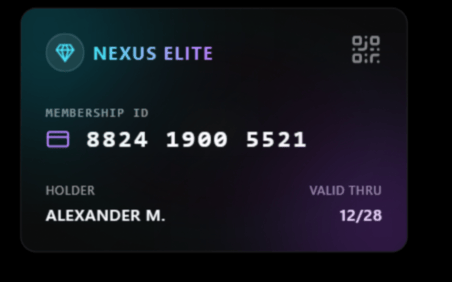
Holographic 3D Card
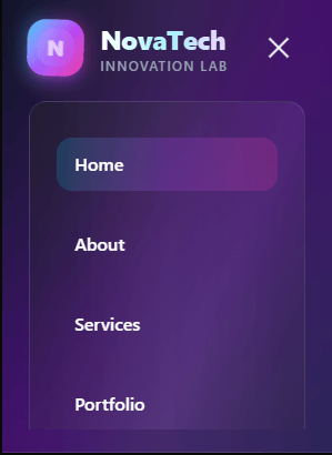
Modern Glassmorphism Header

Sidebar
More in Heroes
View all

SaaS Template
2.4K

Responsive Hero Banner
2K

Hero
1.2K
Centered Hero with Image Fan
932
Editorial Collage Hero
431
Glass Fold
212

HeroSectionWithGradient
336

Aero Hero-3
559
