
About
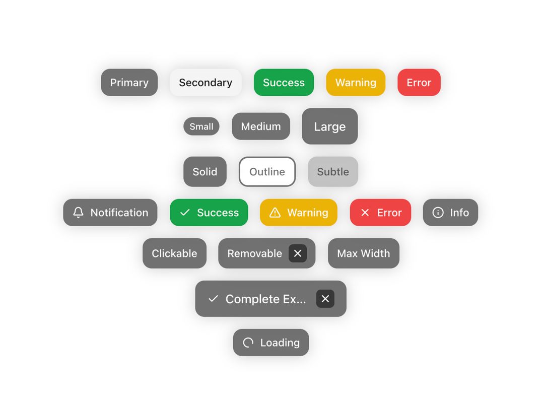
A customizable badge component with various styles and animations.
Built with React and Tailwind. Copy the prompt and paste it into Claude Code, Cursor or Lovable: your agent adds Badge to your project and fits it to your theme.
Code
How Badge is used: the demo's code. The component's own source comes with a free account.
Usage.tsx
"use client";
import { Badge } from "@/components/ui/cvui-badge"
import { Bell, Check, AlertTriangle, X, Info } from "lucide-react";
export const BadgeDemo = () => {
  return (
    <div className="flex flex-col gap-4 items-center justify-center">
      {/* Variants */}
      <div className="flex gap-4 flex-wrap">
        <Badge label="Primary" variant="primary" />
        <Badge label="Secondary" variant="secondary" />
        <Badge label="Success" variant="success" />
        <Badge label="Warning" variant="warning" />
        <Badge label="Error" variant="error" />
      </div>

      {/* Sizes */}
      <div className="flex gap-4 flex-wrap items-center">
        <Badge label="Small" size="small" />
        <Badge label="Medium" size="medium" />
        <Badge label="Large" size="large" />
      </div>

      {/* Appearances */}
      <div className="flex gap-4 flex-wrap">
        <Badge label="Solid" appearance="solid" />
        <Badge label="Outline" appearance="outline" />
        <Badge label="Subtle" appearance="subtle" />
      </div>

      {/* With Icons */}
      <div className="flex gap-4 flex-wrap">
        <Badge label="Notification" icon={<Bell className="w-4 h-4" />} />
        <Badge
          label="Success"
          variant="success"
          icon={<Check className="w-4 h-4" />}
        />
        <Badge
          label="Warning"
          variant="warning"
          icon={<AlertTriangle className="w-4 h-4" />}
        />
        <Badge label="Error" variant="error" icon={<X className="w-4 h-4" />} />
        <Badge
          label="Info"
          variant="primary"
          icon={<Info className="w-4 h-4" />}
        />
      </div>

      {/* Interactive */}
      <div className="flex gap-4 flex-wrap">
        <Badge label="Clickable" onClick={() => alert("Clicked!")} />
        <Badge label="Removable" removable onRemove={() => alert("Removed!")} />
        <Badge label="Max Width" maxWidth={100} />
      </div>

      {/* Combined Features */}
      <Badge
        label="Complete Example"
        size="large"
        icon={<Check className="w-4 h-4" />}
        onClick={() => alert("Clicked!")}
        removable
        maxWidth={200}
      />
      {/* Loading */}
      <Badge label="Loading" isLoading />
    </div>
  );
};
Dependencies
More by Chetan Verma
View all
Floating Action Menu
1.5K
Animated Tabs
1.5K
Video Player
1.3K
Stacked Cards Interaction
796
Dropdowm Menu
548
Input With Tags
524
Avatar Group
505
Stacking Navbar
334