
About
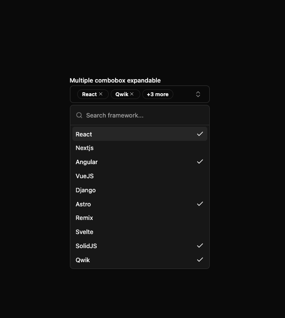
Here is Combobox component
Built with React and Tailwind. Copy the prompt and paste it into Claude Code, Cursor or Lovable: your agent adds Combobox to your project and fits it to your theme.
Code
How Combobox is used: the demo's code. The component's own source comes with a free account.
Usage.tsx
'use client'

import { useId, useState } from 'react'

import { CheckIcon, ChevronsUpDownIcon, XIcon } from 'lucide-react'

import { Badge } from '@/components/ui/badge'
import { Button } from '@/components/ui/button'
import {
  Command,
  CommandEmpty,
  CommandGroup,
  CommandInput,
  CommandItem,
  CommandList
} from '@/components/ui/command'
import { Label } from '@/components/ui/label'
import { Popover, PopoverContent, PopoverTrigger } from '@/components/ui/popover'

const frameworks = [
  { value: 'react', label: 'React' },
  { value: 'nextjs', label: 'Nextjs' },
  { value: 'angular', label: 'Angular' },
  { value: 'vue', label: 'VueJS' },
  { value: 'django', label: 'Django' },
  { value: 'astro', label: 'Astro' },
  { value: 'remix', label: 'Remix' },
  { value: 'svelte', label: 'Svelte' },
  { value: 'solidjs', label: 'SolidJS' },
  { value: 'qwik', label: 'Qwik' }
]

const ComboboxMultipleExpandableDemo = () => {
  const id = useId()
  const [open, setOpen] = useState(false)
  const [expanded, setExpanded] = useState(false)

  const [selectedValues, setSelectedValues] = useState<string[]>(['react', 'qwik', 'solidjs', 'angular', 'astro'])

  const toggleSelection = (value: string) => {
    setSelectedValues(prev => (prev.includes(value) ? prev.filter(v => v !== value) : [...prev, value]))
  }

  const removeSelection = (value: string) => {
    setSelectedValues(prev => prev.filter(v => v !== value))
  }

  // Define maxShownItems before using visibleItems
  const maxShownItems = 2
  const visibleItems = expanded ? selectedValues : selectedValues.slice(0, maxShownItems)
  const hiddenCount = selectedValues.length - visibleItems.length

  return (
    <div className='w-full max-w-xs space-y-2'>
      <Label htmlFor={id}>Multiple combobox expandable</Label>
      <Popover open={open} onOpenChange={setOpen}>
        <PopoverTrigger asChild>
          <Button
            id={id}
            variant='outline'
            role='combobox'
            aria-expanded={open}
            className='h-auto min-h-8 w-full justify-between hover:bg-transparent'
          >
            <div className='flex flex-wrap items-center gap-1 pr-2.5'>
              {selectedValues.length > 0 ? (
                <>
                  {visibleItems.map(val => {
                    const framework = frameworks.find(c => c.value === val)

                    return framework ? (
                      <Badge key={val} variant='outline'>
                        {framework.label}
                        <Button
                          variant='ghost'
                          size='icon'
                          className='size-4'
                          onClick={e => {
                            e.stopPropagation()
                            removeSelection(val)
                          }}
                          asChild
                        >
                          <span>
                            <XIcon className='size-3' />
                          </span>
                        </Button>
                      </Badge>
                    ) : null
                  })}
                  {hiddenCount > 0 || expanded ? (
                    <Badge
                      variant='outline'
                      onClick={e => {
                        e.stopPropagation()
                        setExpanded(prev => !prev)
                      }}
                    >
                      {expanded ? 'Show Less' : `+${hiddenCount} more`}
                    </Badge>
                  ) : null}
                </>
              ) : (
                <span className='text-muted-foreground'>Select framework</span>
              )}
            </div>
            <ChevronsUpDownIcon size={16} className='text-muted-foreground/80 shrink-0' aria-hidden='true' />
          </Button>
        </PopoverTrigger>
        <PopoverContent className='w-(--radix-popper-anchor-width) p-0'>
          <Command>
            <CommandInput placeholder='Search framework...' />
            <CommandList>
              <CommandEmpty>No framework found.</CommandEmpty>
              <CommandGroup>
                {frameworks.map(framework => (
                  <CommandItem
                    key={framework.value}
                    value={framework.value}
                    onSelect={() => toggleSelection(framework.value)}
                  >
                    <span className='truncate'>{framework.label}</span>
                    {selectedValues.includes(framework.value) && <CheckIcon size={16} className='ml-auto' />}
                  </CommandItem>
                ))}
              </CommandGroup>
            </CommandList>
          </Command>
        </PopoverContent>
      </Popover>
    </div>
  )
}

export default ComboboxMultipleExpandableDemo
Dependencies
More by Clevision
View all

Calendar
106
Card Studio
99
Collapsible
43
Button Group
37
Buttons
33
Radio Group 1
30
Basic Avatar
24
Switch
23
More in Forms
View all

Premium Auth
500

Login 2
7
Authentication Card
47

Login 1
52

Contact Card
1K
Login Form
6

Form
16

Book A Demo 3
83
