
About
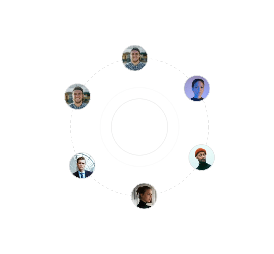
Six avatars circling a dashed ring over a pulsing ripple, for community, team or social-proof sections.
Built with React and Tailwind. Copy the prompt and paste it into Claude Code, Cursor or Lovable: your agent adds Orbit 29 to your project and fits it to your theme.
Code
How Orbit 29 is used: the demo's code. The component's own source comes with a free account.
Usage.tsx
import Orbit29 from '@/components/ui/orbit-29'

const settings = {
  ringSize: 220,
  avatarSize: 42,
  duration: 20,
  dashed: true,
  reverse: false,
  ripple: true,
  playOnlyOnHover: false
}

export default function Demo(props: Partial<typeof settings>) {
  const s = { ...settings, ...props }

  return (
    <div className='flex min-h-100 w-full items-center justify-center bg-background p-8'>
      <Orbit29
        ringSize={s.ringSize}
        avatarSize={s.avatarSize}
        duration={s.duration}
        dashed={s.dashed}
        reverse={s.reverse}
        background={s.ripple ? 'ripple' : 'none'}
        trigger={s.playOnlyOnHover ? 'hover' : 'orbit'}
      />
    </div>
  )
}
Dependencies
More by Clevision
View all

Calendar
106
Card Studio
99
Collapsible
43
Button Group
37
Buttons
33
Radio Group 1
30
Combobox
27
Basic Avatar
24