
About
A hover-driven navigation bar where a highlight pill and dropdown panel morph smoothly between menu items.
Built with React and Tailwind. Copy the prompt and paste it into Claude Code, Cursor or Lovable: your agent adds Navbar Menu to your project and fits it to your theme.
Code
How Navbar Menu is used: the demo's code. The component's own source comes with a free account.
Usage.tsx
import { MenuItem, NavbarMenu } from "@/components/ui/navbar-menu";

export default function NavbarMenuDemo() {
  return (
    <NavbarMenu>
      <MenuItem label="Product">
        <ul className="flex w-40 flex-col gap-1 text-sm">
          <li>
            <a
              href="#components"
              className="text-muted-foreground hover:text-foreground"
            >
              Components
            </a>
          </li>
          <li>
            <a
              href="#themes"
              className="text-muted-foreground hover:text-foreground"
            >
              Themes
            </a>
          </li>
        </ul>
      </MenuItem>
      <MenuItem label="Docs" href="#docs" />
      <MenuItem label="Pricing" href="#pricing" />
    </NavbarMenu>
  );
}
Dependencies
More by colorlibhq
View all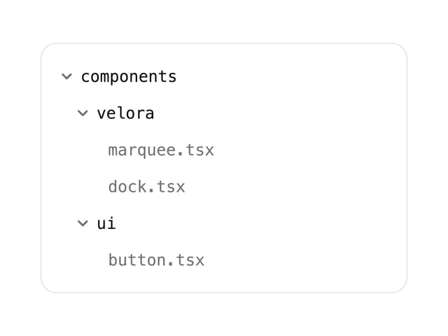

File Tree
More in Navigation
View all

Sidebar
235
Navbar with Theme Toggle
43

Tabs
60

Sidebar
340
Numberless Pagination with Text
11
Oversized 404 Numeral
50
Footer
446
Pagination
43


