About
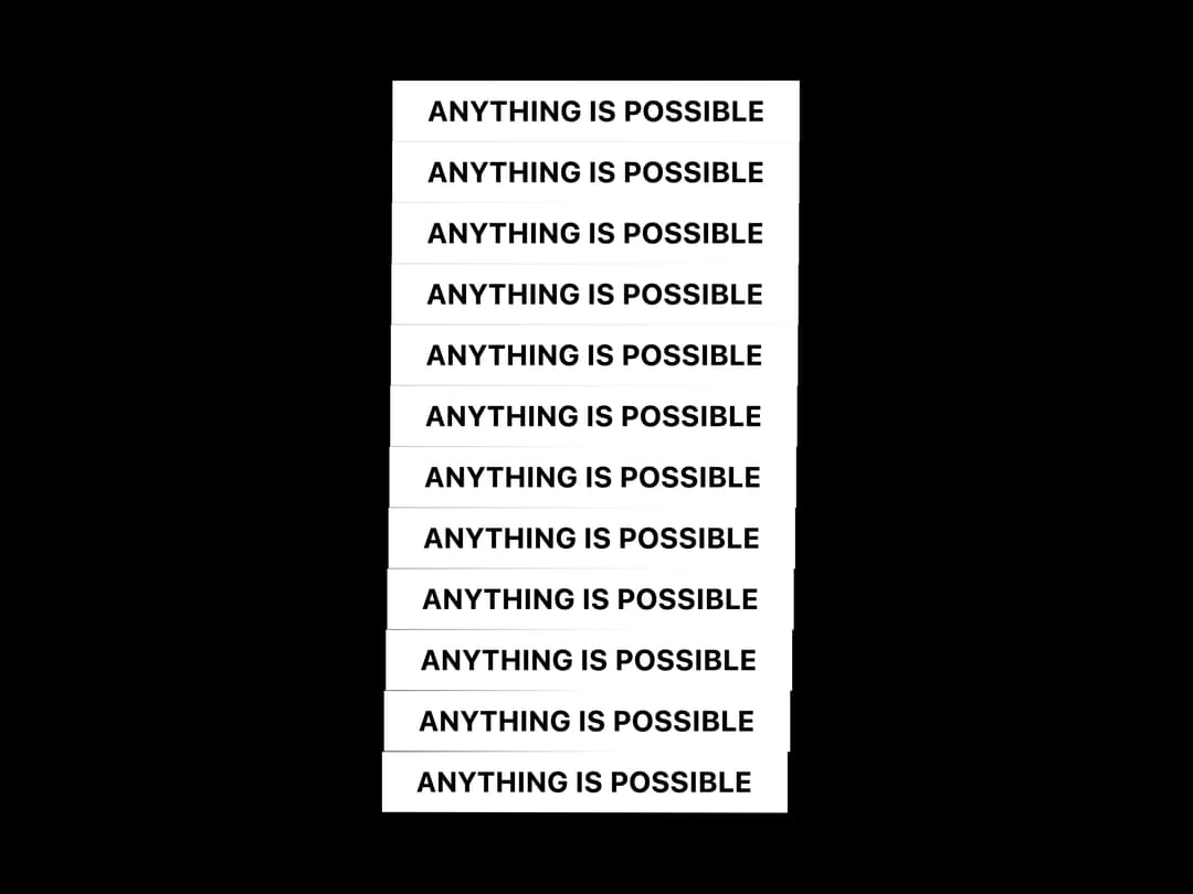
A draggable 3D cube built with pure CSS transforms that lets you place custom content on each of its six faces and control its rotation via a ref.
Built with React and Tailwind. Copy the prompt and paste it into Claude Code, Cursor or Lovable: your agent adds 3D CSS Box to your project and fits it to your theme.
Code
How 3D CSS Box is used: the demo's code. The component's own source comes with a free account.
Usage.tsx
import CSSBox, { CSSBoxRef } from "@/components/ui/css-box";
import { useEffect, useRef } from "react";
import { cn } from "@/lib/utils";

const BoxText = ({ className }: { className?: string }) => (
  <div
    className={cn(
      "w-full h-full text-white flex items-center justify-center p-2 text-sm font-bold bg-transparent",
      className,
    )}
  >
    ANYTHING IS POSSIBLE
  </div>
);

export default function CSSBox2Demo() {
  const boxRefs = useRef<(CSSBoxRef | null)[]>([]);

  useEffect(() => {
    const animate = async () => {
      const delay = (ms: number) =>
        new Promise((resolve) => setTimeout(resolve, ms));

      while (true) {
        // Rotate to right face
        for (let i = 0; i < boxRefs.current.length; i++) {
          boxRefs.current[i]?.showRight();
          await delay(50);
        }
        await delay(1000);

        // Rotate to back face
        for (let i = 0; i < boxRefs.current.length; i++) {
          boxRefs.current[i]?.showBack();
          await delay(50);
        }
        await delay(1000);

        // Rotate to left face
        for (let i = 0; i < boxRefs.current.length; i++) {
          boxRefs.current[i]?.showLeft();
          await delay(50);
        }
        await delay(1000);

        // Rotate to front face
        for (let i = 0; i < boxRefs.current.length; i++) {
          boxRefs.current[i]?.showFront();
          await delay(50);
        }
        await delay(1000);
      }
    };

    animate();
  }, []);

  return (
    <div className="flex flex-col items-center justify-center w-full h-screen bg-black">
      <div>
        {[...Array(12)].map((_, index) => (
          <CSSBox
            key={index}
            ref={(el) => {
              if (el) boxRefs.current[index] = el;
            }}
            width={200}
            height={30}
            depth={200}
            draggable={false}
            className="hover:z-10"
            faces={{
              front: <BoxText className=" border-white " />,
              back: <BoxText className=" border-white" />,
              left: <BoxText className=" border-white bg-white text-black" />,
              right: <BoxText className=" border-white bg-white text-black" />,
            }}
          />
        ))}
      </div>
    </div>
  );
}
Dependencies
More by Daniel Petho
View all
Parallax Floating
2.2K
Text Rotate
2.1K
Typewriter
1.9K
Marquee Along SVG Path
1.4K
Image Trail
1.4K
Animated Gradient With SVG
884
Text Cursor Proximity
781
Pixel Trail
645