About
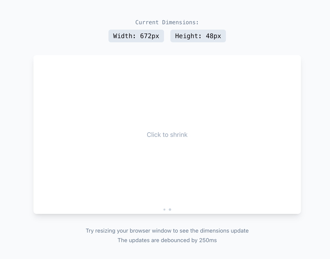
A custom React hook that tracks and returns the dimensions of a DOM element. The dimensions are updated when the element is resized, with debouncing to improve performance.
Built with React and Tailwind. Copy the prompt and paste it into Claude Code, Cursor or Lovable: your agent adds useDimensions to your project and fits it to your theme.
Code
How useDimensions is used: the demo's code. The component's own source comes with a free account.
Usage.tsx
'use client'

import { useRef, useState } from "react"
import { motion } from "framer-motion"
import { useDimensions } from "@/components/hooks/use-debounced-dimensions"

function DimensionsDemo() {
  const [isExpanded, setIsExpanded] = useState(false)
  const containerRef = useRef<HTMLDivElement>(null)
  const dimensions = useDimensions(containerRef)

  return (
    <div className="w-full min-h-screen flex flex-col items-center justify-center bg-slate-50 p-8">
      {/* Main Container */}
      <div className="w-full max-w-2xl space-y-8">
        {/* Dimensions Display */}
        <div className="text-center space-y-2 font-mono">
          <p className="text-sm text-slate-500">Current Dimensions:</p>
          <div className="flex justify-center gap-4">
            <span className="px-3 py-1 bg-slate-200 rounded-md">
              Width: {Math.round(dimensions.width)}px
            </span>
            <span className="px-3 py-1 bg-slate-200 rounded-md">
              Height: {Math.round(dimensions.height)}px
            </span>
          </div>
        </div>

        {/* Resizable Container */}
        <motion.div
          ref={containerRef}
          className="relative bg-white rounded-lg shadow-lg p-6 cursor-pointer"
          animate={{
            height: isExpanded ? 400 : 200,
          }}
          onClick={() => setIsExpanded(!isExpanded)}
          transition={{ type: "spring", bounce: 0.2 }}
        >
          <div className="absolute inset-0 flex items-center justify-center">
            <span className="text-slate-400">
              Click to {isExpanded ? "shrink" : "expand"}
            </span>
          </div>

          {/* Visual Indicators */}
          <div className="absolute inset-x-0 bottom-2 flex justify-center gap-2">
            <motion.div
              className="w-1.5 h-1.5 rounded-full bg-slate-300"
              animate={{ scale: isExpanded ? 0.8 : 1 }}
            />
            <motion.div
              className="w-1.5 h-1.5 rounded-full bg-slate-300"
              animate={{ scale: isExpanded ? 1 : 0.8 }}
            />
          </div>
        </motion.div>

        {/* Instructions */}
        <div className="text-center text-sm text-slate-500">
          <p>Try resizing your browser window to see the dimensions update</p>
          <p className="mt-1">The updates are debounced by 250ms</p>
        </div>
      </div>
    </div>
  )
}

export { DimensionsDemo }
Dependencies
More by Daniel Petho
View all
Parallax Floating
2.2K
Text Rotate
2.1K
Typewriter
1.9K
Marquee Along SVG Path
1.4K
Image Trail
1.4K
Animated Gradient With SVG
884
Text Cursor Proximity
781
Pixel Trail
645