
About
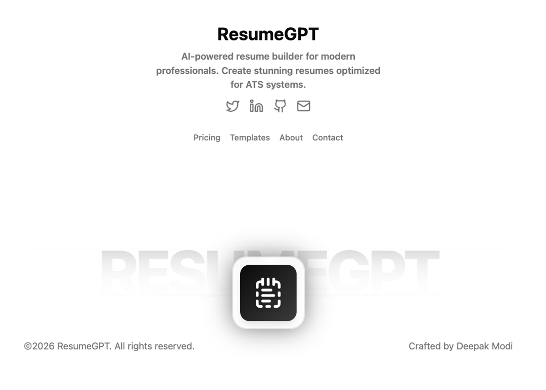
A modern, fully customizable footer component with animated background text, social links, navigation menu, and a floating brand icon. Features smooth hover animations, responsive design, and dark mode support using shadcn's neutral color palette.
Built with React and Tailwind. Copy the prompt and paste it into Claude Code, Cursor or Lovable: your agent adds Modem Animated Footer to your project and fits it to your theme.
Code
How Modem Animated Footer is used: the demo's code. The component's own source comes with a free account.
Usage.tsx
"use client";
import { Footer } from "@/components/ui/modem-animated-footer";
import {
  Twitter,
  Linkedin,
  Github,
  Mail,
  NotepadTextDashed,
} from "lucide-react";

export default function FooterDemo() {
  const socialLinks = [
    {
      icon: <Twitter className="w-6 h-6" />,
      href: "https://twitter.com",
      label: "Twitter",
    },
    {
      icon: <Linkedin className="w-6 h-6" />,
      href: "https://linkedin.com",
      label: "LinkedIn",
    },
    {
      icon: <Github className="w-6 h-6" />,
      href: "https://github.com",
      label: "GitHub",
    },
    {
      icon: <Mail className="w-6 h-6" />,
      href: "mailto:contact@resumegpt.com",
      label: "Email",
    },
  ];

  const navLinks = [
    { label: "Pricing", href: "/" },
    { label: "Templates", href: "/" },
    { label: "About", href: "/" },
    { label: "Contact", href: "/" },
  ];

  return (
    <Footer
      brandName="ResumeGPT"
      brandDescription="AI-powered resume builder for modern professionals. Create stunning resumes optimized for ATS systems."
      socialLinks={socialLinks}
      navLinks={navLinks}
      creatorName="Deepak Modi"
      creatorUrl="https://deepakmodi.tech"
      brandIcon={<NotepadTextDashed className="w-8 sm:w-10 md:w-14 h-8 sm:h-10 md:h-14 text-background drop-shadow-lg" />}
    />
  );
}
Dependencies
More in Navigation
View all

Sidebar
234

Tabs
60
Newsletter Signup Footer
16
Progress Bar Stepper
36

Footer 2
201
Navbar with Theme Toggle
43

Navbar
71

Pagination
86
