
About
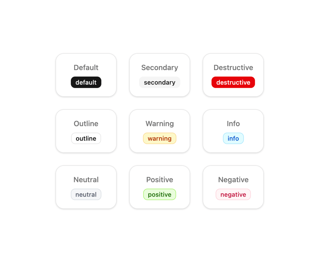
Simple, and beautifully styled badges that support both light and dark themes. Inspired by Shadcn/UI.
Built with React and Tailwind. Copy the prompt and paste it into Claude Code, Cursor or Lovable: your agent adds Beautiful Simple Badges to your project and fits it to your theme.
Code
How Beautiful Simple Badges is used: the demo's code. The component's own source comes with a free account.
Usage.tsx
import { Badge } from "@/components/ui/beautiful-simple-badges";

export default function DemoOne() {
  const variants = [
    "default",
    "secondary",
    "destructive",
    "outline",
    "warning",
    "info",
    "neutral",
    "positive",
    "negative",
  ] as const;

  return (
    <div className="grid gap-6 sm:grid-cols-2 md:grid-cols-3 lg:grid-cols-4 xl:grid-cols-5 p-6">
      {variants.map((variant) => (
        <div
          key={variant}
          className="flex flex-col items-center justify-center gap-2 border border-border rounded-2xl p-4 bg-background shadow-sm hover:shadow-md transition-shadow"
        >
          <span className="text-sm font-medium text-muted-foreground capitalize">
            {variant}
          </span>
          <Badge variant={variant}>{variant}</Badge>
        </div>
      ))}
    </div>
  );
}