
About
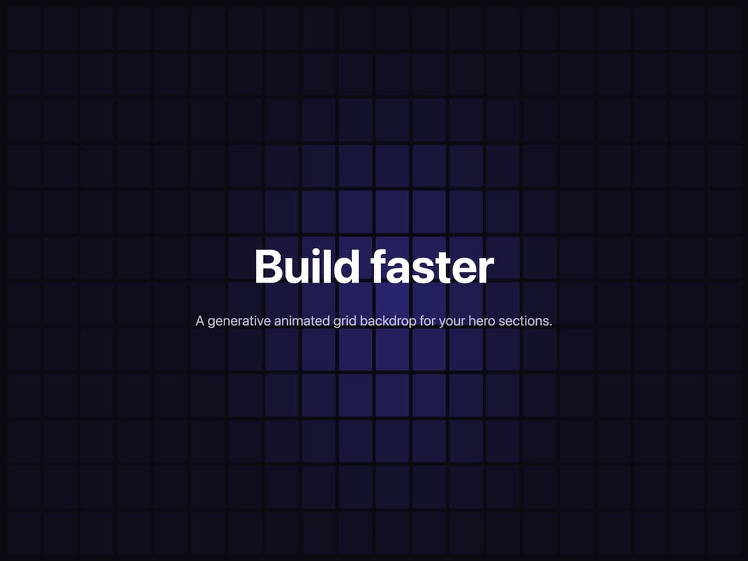
A generative, theme‑aware hero component with an animated grid background. Supports pulse, wave, and random animations, mouse‑follow glow, and full prop‑driven customization. Ideal for visually immersive landing sections, interactive demos, and remixable UI experiments.
Built with React and Tailwind. Copy the prompt and paste it into Claude Code, Cursor or Lovable: your agent adds DataGridHero to your project and fits it to your theme.
Code
How DataGridHero is used: the demo's code. The component's own source comes with a free account.
Usage.tsx
import DataGridHero from "@/components/ui/data-grid-hero";

const settings = {
  rows: 12,
  cols: 20,
  spacing: 6,
  duration: 3,
  color: "#4f46e5",
  animationType: "pulse",
  pulseEffect: true,
  mouseGlow: true,
  opacityMin: 0.05,
  opacityMax: 0.6,
  background: "#0b0b12",
};

export default function Demo(props: Partial<typeof settings>) {
  const s = { ...settings, ...props };
  return (
    <div className="relative h-screen w-full">
      <DataGridHero {...s}>
        <h1
          style={{
            fontSize: "clamp(2.5rem, 8vw, 5rem)",
            fontWeight: 700,
            color: "#ffffff",
            margin: 0,
          }}
        >
          Build faster
        </h1>
        <p
          style={{
            fontSize: "clamp(1rem, 2.5vw, 1.5rem)",
            color: "rgba(255,255,255,0.7)",
            marginTop: "1rem",
          }}
        >
          A generative animated grid backdrop for your hero sections.
        </p>
      </DataGridHero>
    </div>
  );
}
Dependencies
More by Dhileep Kumar GM
View all

Aether Flow Hero
1.9K
Woven Light Hero
1.5K
AnomalousMatterHero
1.5K
PulseFit hero
922
Mountain Scene
859
HolographicCard
820
3D Animation
765
Cybernetic Bento Grid
556
More in Heroes
View all

SaaS Template
2.4K

Responsive Hero Banner
2K

Hero
1.2K
Centered Hero with Image Fan
931
Editorial Collage Hero
430
Glass Fold
212

Minimalist Hero Fashion
285

HeroSectionWithGradient
336
