
About
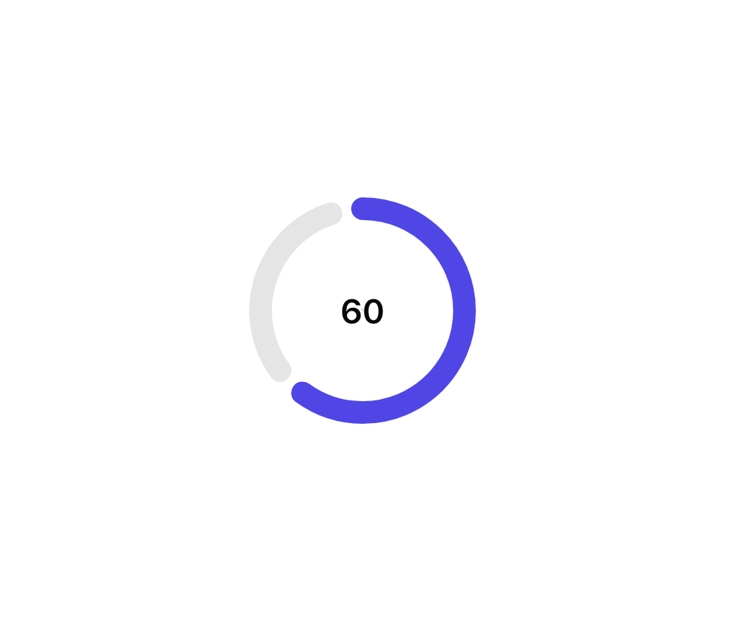
Animated Circular Progress Bar is a component that displays a circular gauge with a percentage value.
Built with React and Tailwind. Copy the prompt and paste it into Claude Code, Cursor or Lovable: your agent adds Animated Circular Progress Bar to your project and fits it to your theme.
Code
How Animated Circular Progress Bar is used: the demo's code. The component's own source comes with a free account.
Usage.tsx
"use client"

import { useEffect, useState } from "react"

import { AnimatedCircularProgressBar } from "@/components/ui/animated-circular-progress-bar"

export function AnimatedCircularProgressBarDemo() {
  const [value, setValue] = useState(0)

  useEffect(() => {
    const handleIncrement = (prev: number) => {
      if (prev === 100) {
        return 0
      }
      return prev + 10
    }
    setValue(handleIncrement)
    const interval = setInterval(() => setValue(handleIncrement), 2000)
    return () => clearInterval(interval)
  }, [])

  return (
    <AnimatedCircularProgressBar
      max={100}
      min={0}
      value={value}
      gaugePrimaryColor="rgb(79 70 229)"
      gaugeSecondaryColor="rgba(0, 0, 0, 0.1)"
    />
  )
}
More by Dillion Verma
View all

Interactive Hover Button
3.4K
Rainbow Button
2.4K
Globe
2.2K
Animated Beam
1.9K
Text Reveal
1.7K
Sparkles Text
1.2K
Confetti
1.2K
Interactive Icon Cloud
1.1K