
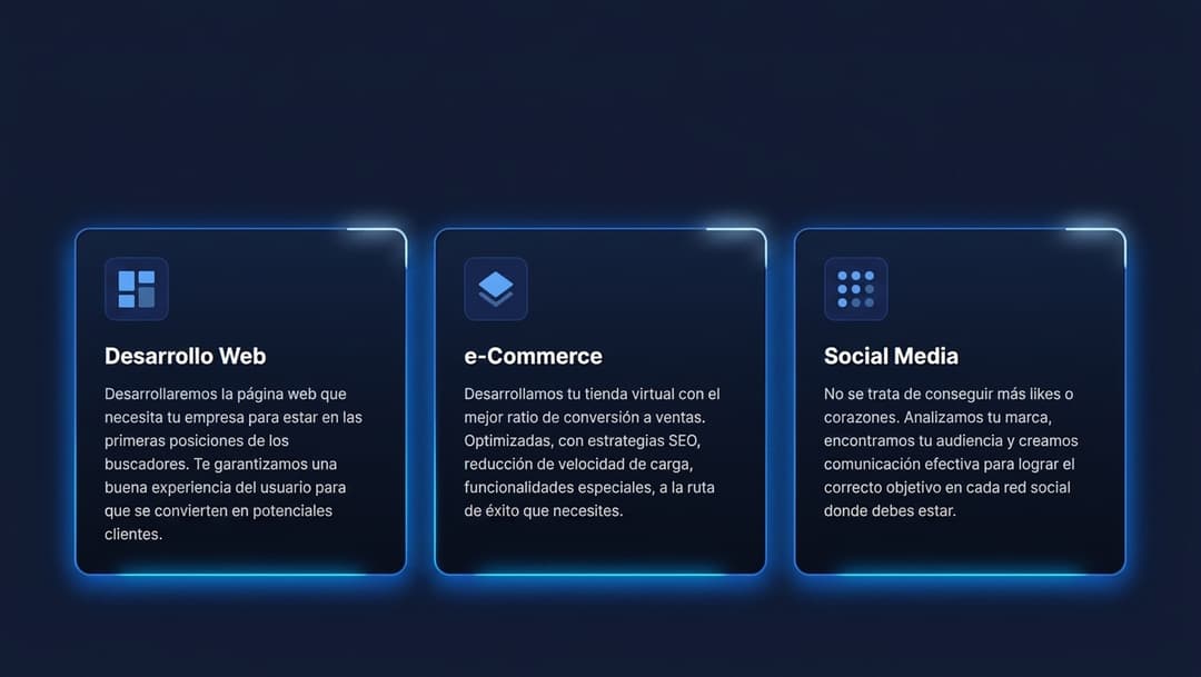
About
A modern feature card component built with Tailwind CSS featuring a spinning border glow animation.
Built with React and Tailwind. Copy the prompt and paste it into Claude Code, Cursor or Lovable: your agent adds Animated Glow Feature Card to your project and fits it to your theme.
Code
How Animated Glow Feature Card is used: the demo's code. The component's own source comes with a free account.
Usage.tsx
import { AnimatedGlowCard } from "@/components/ui/animated-glow-feature-card";

export default function DemoOne() {
  return (
    <div className="p-8 max-w-md mx-auto">
      <AnimatedGlowCard
        icon={
          <svg className="w-8 h-8" fill="none" viewBox="0 0 24 24" stroke="currentColor">
            <path strokeLinecap="round" strokeLinejoin="round" strokeWidth={2} d="M10 20l4-16m4 4l4 4-4 4M6 16l-4-4 4-4" />
          </svg>
        }
        title="Desarrollo Web"
        paragraph="Desarrollamos la página web que necesita tu empresa para estar en las primeras posiciones de los buscadores con un excelente diseño responsive."
      />
    </div>
  );
}