About
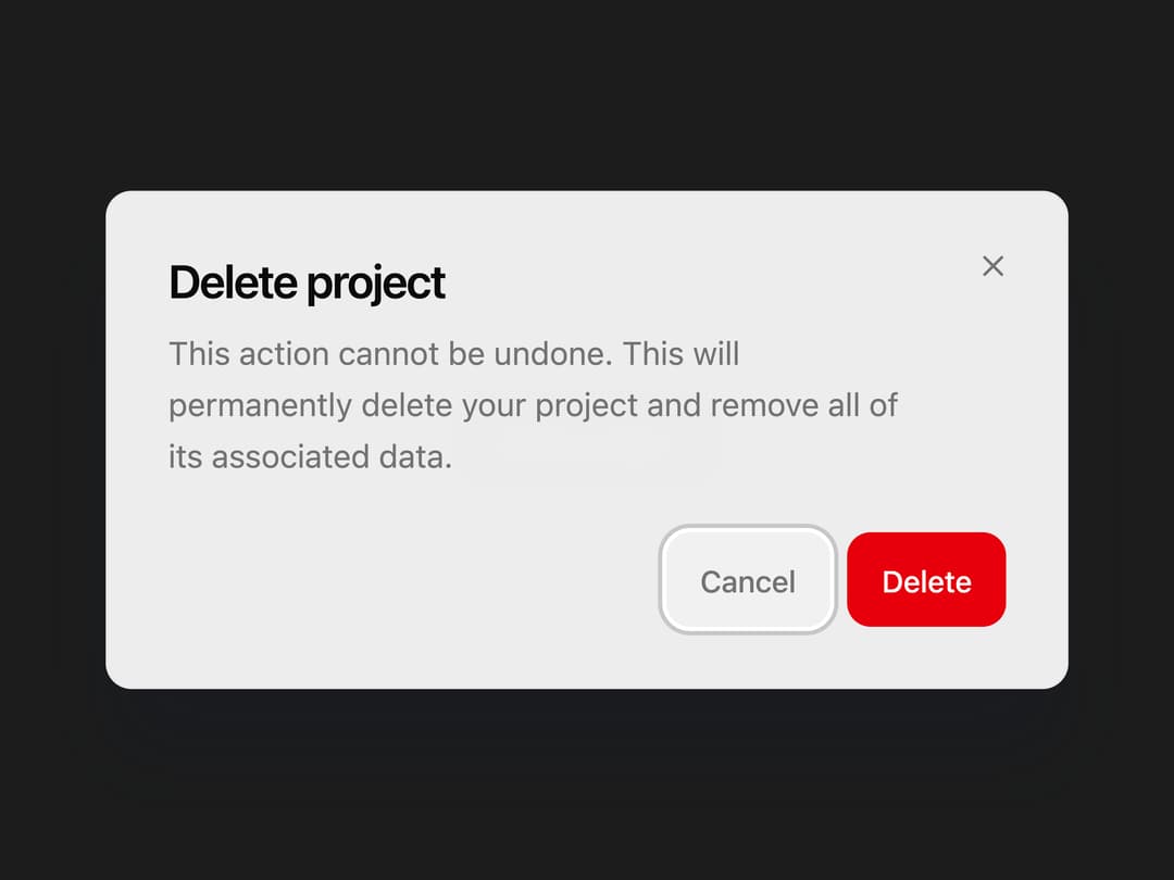
An animated modal dialog built on Base UI primitives with spring open/close motion, blurred overlay, and composable header, body, footer, and action parts.
Built with React and Tailwind. Copy the prompt and paste it into Claude Code, Cursor or Lovable: your agent adds Dialog to your project and fits it to your theme.
Code
How Dialog is used: the demo's code. The component's own source comes with a free account.
Usage.tsx
"use client";

import {
  Dialog,
  DialogTrigger,
  DialogContent,
  DialogHeader,
  DialogTitle,
  DialogDescription,
  DialogFooter,
  DialogCancel,
  DialogAction,
} from "@/components/ui/b-dialog";

export default function DialogDemo() {
  return (
    <div className="flex min-h-[320px] items-center justify-center p-6">
      <Dialog>
        <DialogTrigger>Delete project</DialogTrigger>
        <DialogContent size="sm">
          <DialogHeader>
            <DialogTitle>Delete project</DialogTitle>
            <DialogDescription>
              This action cannot be undone. This will permanently delete your
              project and remove all of its associated data.
            </DialogDescription>
          </DialogHeader>
          <DialogFooter>
            <DialogCancel>Cancel</DialogCancel>
            <DialogAction variant="destructive">Delete</DialogAction>
          </DialogFooter>
        </DialogContent>
      </Dialog>
    </div>
  );
}
Dependencies
More by Edwin Vakayil
View all
Origin Button
770
Infinite Ribbon
524
Shimmer Text
402
Dia Text
345
Icon Bar
244
FAQ Pro
224
Verified Badge
212
New Card
183