About
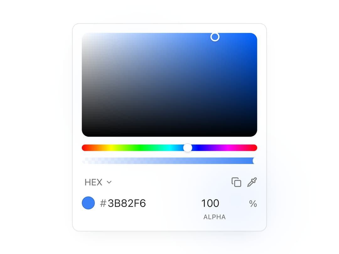
An inline or popover HSV color picker with a saturation field, hue and alpha sliders, hex/RGB/HSL/OKLCH readouts, presets, and an EyeDropper button for picking colors from the screen.
Built with React and Tailwind. Copy the prompt and paste it into Claude Code, Cursor or Lovable: your agent adds Color Picker to your project and fits it to your theme.
Code
How Color Picker is used: the demo's code. The component's own source comes with a free account.
Usage.tsx
"use client";

import ColorPicker from "@/components/ui/color-picker";
import { useState } from "react";

export default function ColorPickerDemo() {
  const [color, setColor] = useState("#3B82F6");

  return (
    <div className="flex w-full items-center justify-center px-4 py-6">
      <div className="flex w-full flex-col items-center gap-4 text-center">
        <ColorPicker
          aria-label="Brand color"
          name="brand-color"
          onChange={setColor}
          value={color}
          showCopy
        />
      </div>
    </div>
  );
}
Dependencies
More by Edwin Vakayil
View all
Origin Button
766
Infinite Ribbon
523
Shimmer Text
401
Dia Text
344
Icon Bar
244
FAQ Pro
224
Verified Badge
211
New Card
182