About
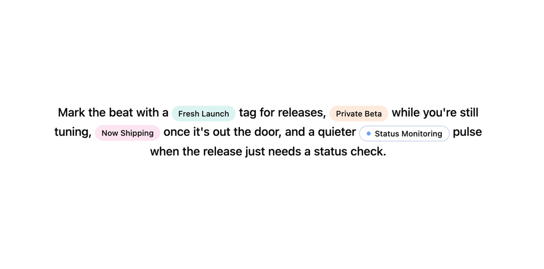
This is a new badge component
Built with React and Tailwind. Copy the prompt and paste it into Claude Code, Cursor or Lovable: your agent adds New Badge to your project and fits it to your theme.
Code
How New Badge is used: the demo's code. The component's own source comes with a free account.
Usage.tsx
"use client";
import { Badge } from "@/components/ui/new-badge";

export function BadgePreview() {
  return (
    <p className="max-w-2xl text-center text-lg font-medium leading-relaxed dark:text-neutral-100">
      Mark the beat with a <Badge color="teal" waveColor="rgba(20,184,166,0.3)">Fresh Launch</Badge> tag for
      releases, <Badge color="orange" waveColor="rgba(249,115,22,0.3)">Private Beta</Badge> while you're still
      tuning, <Badge color="pink" waveColor="rgba(236,72,153,0.3)">Now Shipping</Badge> once it's out the door,
      and a quieter{" "}
      <Badge color="blue" variant="dot">
        Status Monitoring
      </Badge>{" "}
      pulse when the release just needs a status check.
    </p>
  );
}

export default BadgePreview
Dependencies
More by Edwin Vakayil
View all
Origin Button
769
Infinite Ribbon
524
Shimmer Text
402
Dia Text
345
Icon Bar
244
FAQ Pro
224
Verified Badge
212
New Card
183