About
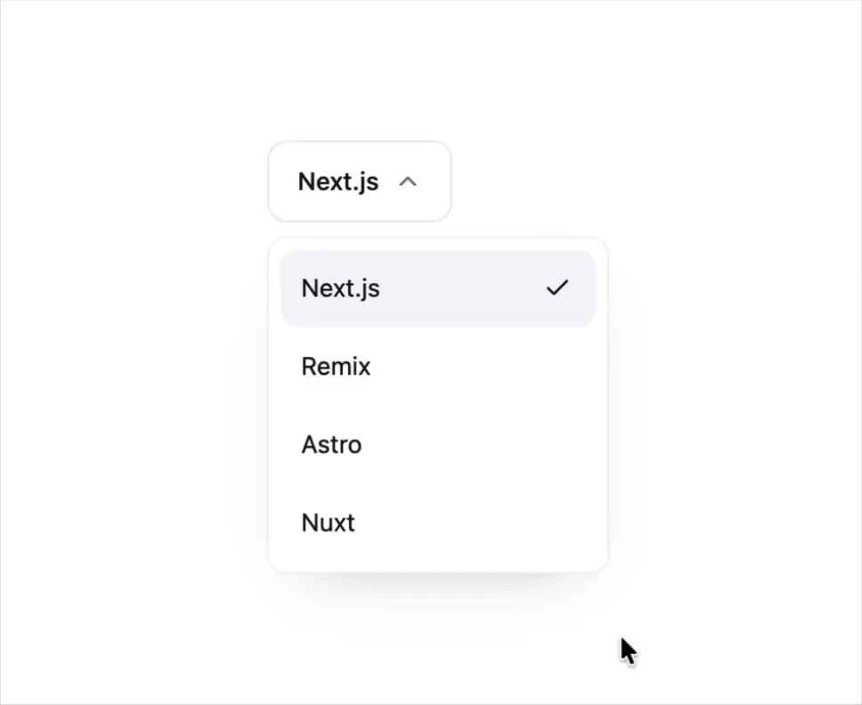
A compound dropdown menu with select and action variants, animated row highlight, checkbox and radio items, submenus, and a scrollable panel built on Radix primitives.
Built with React and Tailwind. Copy the prompt and paste it into Claude Code, Cursor or Lovable: your agent adds Dropdown (Radix UI) to your project and fits it to your theme.
Code
How Dropdown (Radix UI) is used: the demo's code. The component's own source comes with a free account.
Usage.tsx
"use client";

import * as React from "react";
import {
  Dropdown,
  DropdownContent,
  DropdownItem,
  DropdownTrigger,
  DropdownValue,
} from "@/components/ui/r-dropdown";

export default function DropdownDemo() {
  return (
    <div className="flex min-h-[220px] w-full items-center justify-center p-10">
      <div className="w-64">
        <Dropdown defaultValue="next">
          <DropdownTrigger>
            <DropdownValue placeholder="Select a framework" />
          </DropdownTrigger>
          <DropdownContent className="w-full">
            <DropdownItem value="next">Next.js</DropdownItem>
            <DropdownItem value="remix">Remix</DropdownItem>
            <DropdownItem value="astro">Astro</DropdownItem>
            <DropdownItem value="nuxt">Nuxt</DropdownItem>
          </DropdownContent>
        </Dropdown>
      </div>
    </div>
  );
}
Dependencies
More by Edwin Vakayil
View all
Origin Button
766
Infinite Ribbon
523
Shimmer Text
400
Dia Text
344
Icon Bar
244
FAQ Pro
224
Verified Badge
211
New Card
182