About
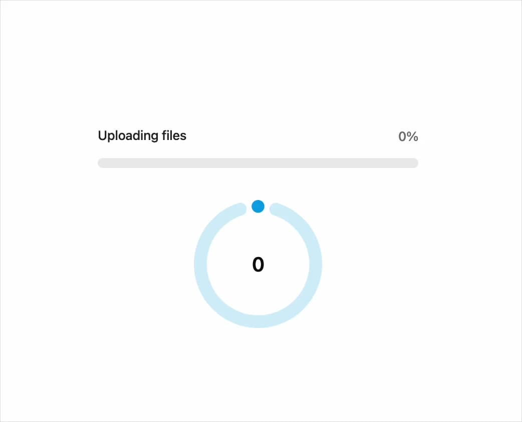
An animated progress bar and circular progress ring with spring-smoothed fill, optional label/helper text, tone variants, and an indeterminate loading state.
Built with React and Tailwind. Copy the prompt and paste it into Claude Code, Cursor or Lovable: your agent adds Progress to your project and fits it to your theme.
Code
How Progress is used: the demo's code. The component's own source comes with a free account.
Usage.tsx
import * as React from "react";
import { Progress } from "@/components/ui/r-progress";

export default function ProgressDemo() {
  const [value, setValue] = React.useState(0);

  React.useEffect(() => {
    const interval = setInterval(() => {
      setValue((prev) => (prev >= 100 ? 0 : prev + 10));
    }, 800);

    return () => clearInterval(interval);
  }, []);

  return (
    <div className="flex w-full max-w-sm flex-col items-center gap-8 p-8">
      <Progress label="Uploading files" value={value} />
      <Progress variant="circular" tone="brand" value={value} />
    </div>
  );
}
Dependencies
More by Edwin Vakayil
View all
Origin Button
769
Infinite Ribbon
524
Shimmer Text
402
Dia Text
345
Icon Bar
244
FAQ Pro
224
Verified Badge
212
New Card
183