
About
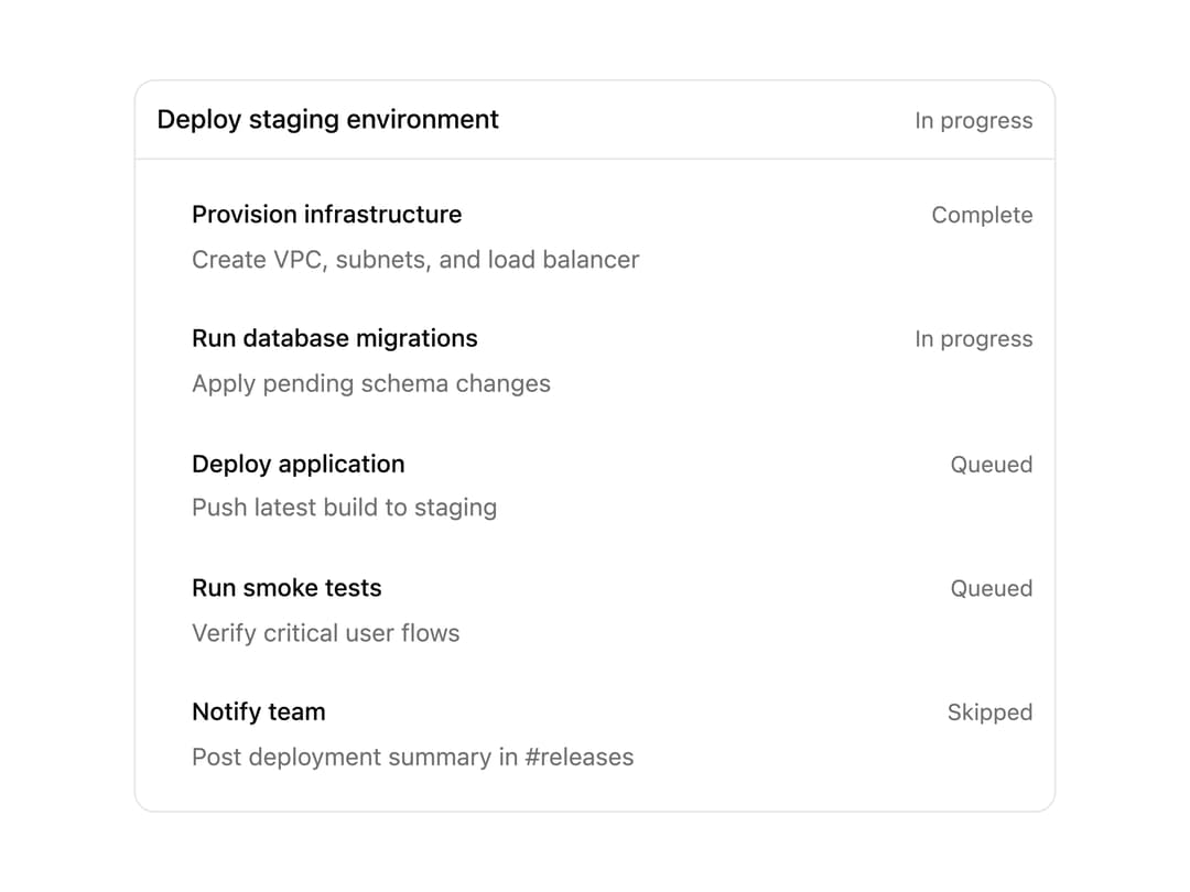
A card that shows a multi-step plan with an overall status badge and a per-step status list, used for agent/task progress displays.
Built with React and Tailwind. Copy the prompt and paste it into Claude Code, Cursor or Lovable: your agent adds Plan to your project and fits it to your theme.
Code
How Plan is used: the demo's code. The component's own source comes with a free account.
Usage.tsx
import Plan from "@/components/ui/plan";

export default function PlanFailedDemo() {
  return (
    <div className="flex w-full max-w-xl items-center justify-center p-6">
      <Plan
        id="rotate-api-keys"
        title="Rotate API keys"
        status="partial"
        steps={[
          {
            id: "step-1",
            title: "Generate new credentials",
            detail: "Create replacement keys in the vault",
            status: "complete",
          },
          {
            id: "step-2",
            title: "Update service configuration",
            detail: "Push new keys to the config store",
            status: "failed",
          },
          {
            id: "step-3",
            title: "Revoke old credentials",
            status: "queued",
          },
        ]}
      />
    </div>
  );
}
More by ethandaya
View all
Outcome
Status Loader