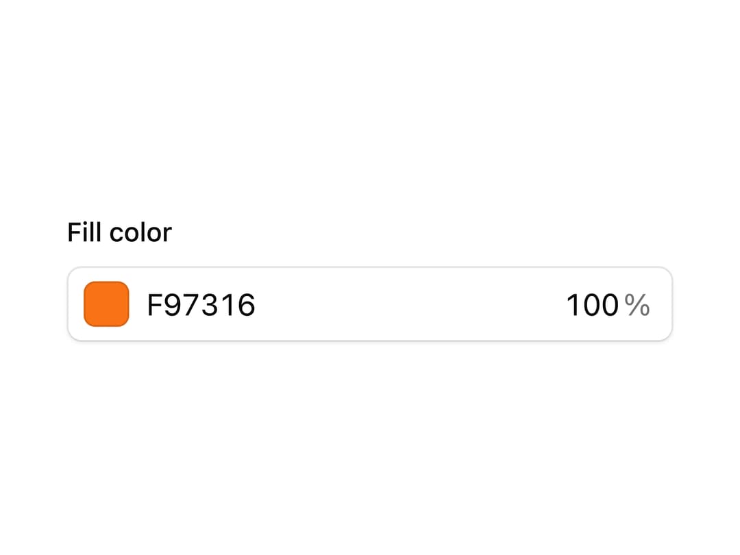
About
A popover-based color picker with OKLCH, HSL, RGB, and hex input formats, a saturation/lightness canvas, hue and alpha sliders, and a screen eyedropper for picking colors in design or document-editing tools.
Built with React and Tailwind. Copy the prompt and paste it into Claude Code, Cursor or Lovable: your agent adds Color Picker to your project and fits it to your theme.
Code
How Color Picker is used: the demo's code. The component's own source comes with a free account.
Usage.tsx
"use client";

import * as React from "react";

import { ColorPicker } from "@/components/ui/document-color-picker";

export default function ColorPickerDemo() {
  const [fill, setFill] = React.useState("#f97316");

  return (
    <div className="flex w-full max-w-xs flex-col gap-2">
      <label className="text-sm font-medium text-foreground">Fill color</label>
      <ColorPicker value={fill} onChange={setFill} showAlpha />
    </div>
  );
}
Dependencies
More by Extend
View all

Bounding Box Citations
51
Layout Blocks
13
Autocomplete

Tooltip

Popover
Separator
Input

Spinner
More in Forms
View all

Premium Auth
500

Login 2
7
Authentication Card
47

Login 1
52

Contact Card
1K
Login Form
6

Form
16

Book A Demo 3
83
