About
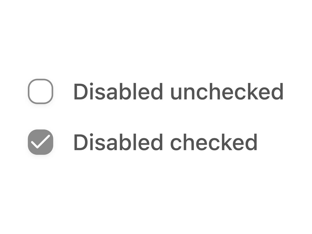
A checkbox pattern showing disabled unchecked and disabled checked states with labels.
Built with React and Tailwind. Copy the prompt and paste it into Claude Code, Cursor or Lovable: your agent adds Disabled Checkbox to your project and fits it to your theme.
Code
How Disabled Checkbox is used: the demo's code. The component's own source comes with a free account.
Usage.tsx
import { Checkbox03 } from "@/components/ui/checkbox-03";

export default function Default() {
  return (
    <div className="flex min-h-svh items-center justify-center p-6">
      <Checkbox03 />
    </div>
  );
}
More by felipemenezes098
View all
Centered Hero with Image Fan
933
Editorial Collage Hero
431
Split Hero With Image Cards
402
Editorial Image Hero
388
Scroll 01
342
Real Estate Search Hero
190
Editorial Hero
173
Hero with Dashboard Mockup
123
More in Forms
View all

Premium Auth
500

Login 1
52

Book A Demo 3
83
Authentication Card
47
Book A Demo 1
69

Contact Card
1K

Login Card
32

Login 2
7
