About
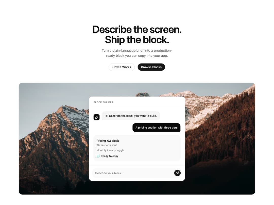
A centered marketing hero section with a headline, dual call-to-action buttons, a full-width photo with a floating chat/demo panel overlaid on it, and a logo strip below.
Built with React and Tailwind. Copy the prompt and paste it into Claude Code, Cursor or Lovable: your agent adds Product Hero with Demo Panel to your project and fits it to your theme.
Code
How Product Hero with Demo Panel is used: the demo's code. The component's own source comes with a free account.
Usage.tsx
import { Hero14, type Hero14Props } from "@/components/ui/hero-14";

export const values = {
  title: "Describe the screen. Ship the block.",
  description:
    "Turn a plain-language brief into a production-ready block you can copy into your app.",
  image:
    "https://cdn.21st.dev/assets/mirror/4f/4fe63ac180f95ef8238e0c0bc6e4f3ffb0f2294f16970badb8c79554003a68c0.jpg",
  imageAlt: "A pastel wildflower meadow at golden hour",
  logos: ["Northwind", "Vertex Labs", "Solstice", "Anchorpoint", "Lumen"],
  animation: "subtle",
  variant: "standard",
  primaryCTA: {
    ctaEnabled: true,
    text: "Browse Blocks",
    link: "",
    size: "default",
  },
  secondaryCTA: {
    ctaEnabled: true,
    text: "How It Works",
    link: "",
    variant: "outline",
    size: "default",
  },
} satisfies Hero14Props;

export default function Hero14Example() {
  return <Hero14 {...values} />;
}
Dependencies
More by felipemenezes098
View all
Centered Hero with Image Fan
932
Editorial Collage Hero
431
Split Hero With Image Cards
402
Editorial Image Hero
388
Scroll 01
341
Real Estate Search Hero
190
Editorial Hero
173
Hero with Dashboard Mockup
123
More in Heroes
View all

SaaS Template
2.4K

Responsive Hero Banner
2K

Hero
1.2K
Glass Fold
212

Minimalist Hero Fashion
285

HeroSectionWithGradient
336
Home Section
66

Aero Hero-3
558
