About
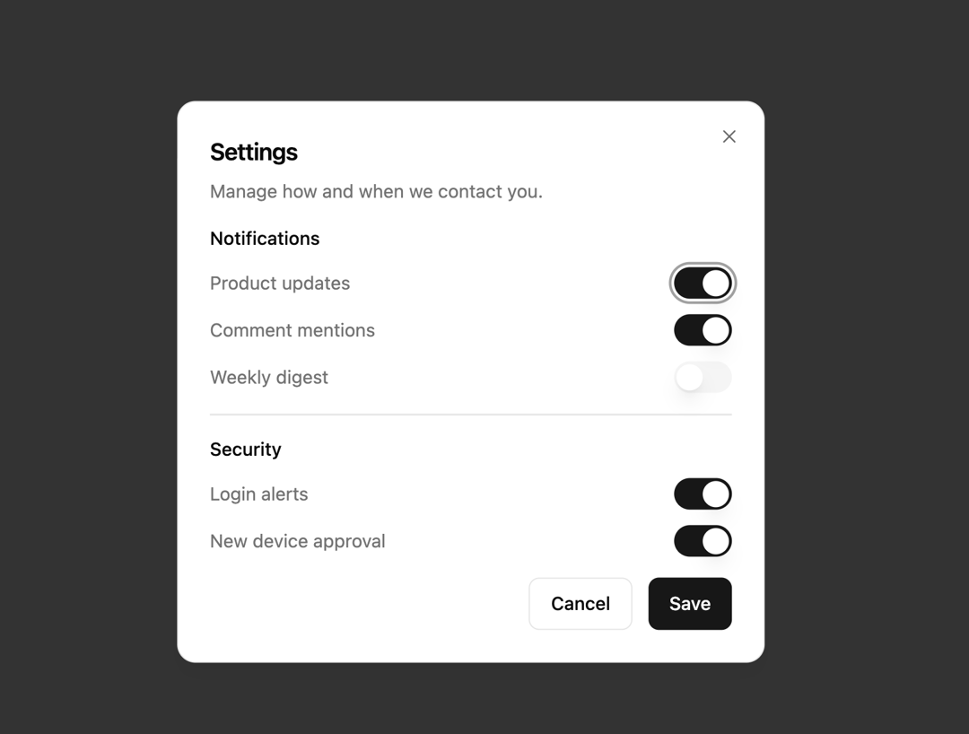
Here is Dialog components
Built with React and Tailwind. Copy the prompt and paste it into Claude Code, Cursor or Lovable: your agent adds The Dialog to your project and fits it to your theme.
Code
How The Dialog is used: the demo's code. The component's own source comes with a free account.
Usage.tsx
import { Button } from '@/components/ui/button'
import {
  Dialog,
  DialogClose,
  DialogContent,
  DialogDescription,
  DialogFooter,
  DialogHeader,
  DialogTitle,
  DialogTrigger,
} from '@/components/ui/dialog'
import { Separator } from '@/components/ui/separator'
import { Switch } from '@/components/ui/switch'

export default function Dialog14() {
  return (
    <Dialog>
      <DialogTrigger asChild>
        <Button variant="outline">Notification settings</Button>
      </DialogTrigger>
      <DialogContent className="sm:max-w-md">
        <DialogHeader>
          <DialogTitle>Settings</DialogTitle>
          <DialogDescription>
            Manage how and when we contact you.
          </DialogDescription>
        </DialogHeader>
        <div className="flex flex-col gap-4">
          <div className="flex flex-col gap-3">
            <h4 className="text-sm font-medium">Notifications</h4>
            <div className="flex items-center justify-between gap-3">
              <span className="text-muted-foreground text-sm">
                Product updates
              </span>
              <Switch defaultChecked />
            </div>
            <div className="flex items-center justify-between gap-3">
              <span className="text-muted-foreground text-sm">
                Comment mentions
              </span>
              <Switch defaultChecked />
            </div>
            <div className="flex items-center justify-between gap-3">
              <span className="text-muted-foreground text-sm">
                Weekly digest
              </span>
              <Switch />
            </div>
          </div>
          <Separator />
          <div className="flex flex-col gap-3">
            <h4 className="text-sm font-medium">Security</h4>
            <div className="flex items-center justify-between gap-3">
              <span className="text-muted-foreground text-sm">
                Login alerts
              </span>
              <Switch defaultChecked />
            </div>
            <div className="flex items-center justify-between gap-3">
              <span className="text-muted-foreground text-sm">
                New device approval
              </span>
              <Switch defaultChecked />
            </div>
          </div>
        </div>
        <DialogFooter>
          <DialogClose asChild>
            <Button variant="outline">Cancel</Button>
          </DialogClose>
          <Button>Save</Button>
        </DialogFooter>
      </DialogContent>
    </Dialog>
  )
}
Dependencies
More by felipemenezes098
View all
Centered Hero with Image Fan
932
Editorial Collage Hero
431
Split Hero With Image Cards
402
Editorial Image Hero
388
Scroll 01
341
Real Estate Search Hero
190
Editorial Hero
173
Hero with Dashboard Mockup
123