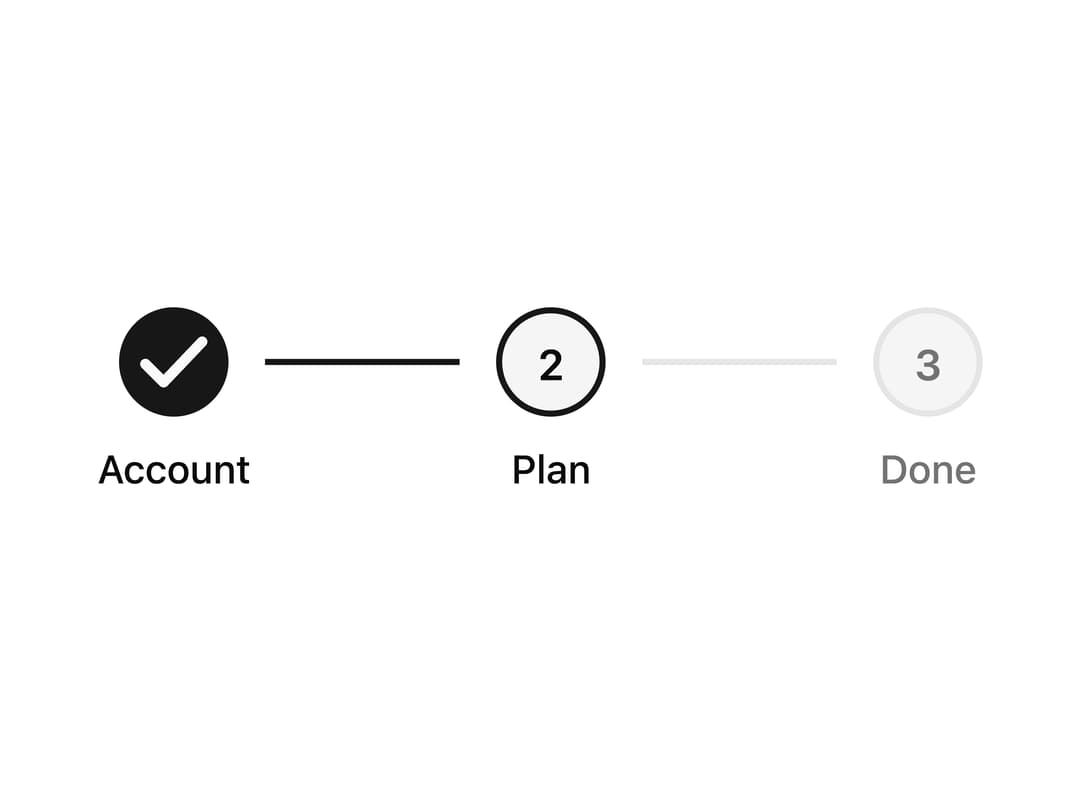
About
A horizontal onboarding stepper that animates a filled circle and connector line between numbered steps as the active step changes.
Built with React and Tailwind. Copy the prompt and paste it into Claude Code, Cursor or Lovable: your agent adds Stepper to your project and fits it to your theme.
Code
How Stepper is used: the demo's code. The component's own source comes with a free account.
Usage.tsx
import Stepper from "@/components/ui/stepper";

export default function StepperDemo() {
  return (
    <div className="relative flex h-40 w-full max-w-md items-center justify-center">
      <Stepper steps={["Account", "Plan", "Done"]} activeIndex={1} />
    </div>
  );
}
More by framecn
View all
Blur Out Up
33
Shader Dithering
29
Zoom Through Transition
19
Top Down Letters
19
Strikethrough Replace
17
Format Morph
14
Mesh Gradient Background
11
Terminal to Browser Deploy
9