

About
Trippy animation of repitition
Built with React and Tailwind. Copy the prompt and paste it into Claude Code, Cursor or Lovable: your agent adds Bloom to your project and fits it to your theme.
Code
How Bloom is used: the demo's code. The component's own source comes with a free account.
Usage.tsx
"use client";
import React, { useEffect, useState } from 'react';
interface NestedSquaresProps {
count?: number;
baseSize?: number;
paddingIncrement?: number;
animationDuration?: number;
staggerDelay?: number;
className?: string;
}
const NestedSquares: React.FC<NestedSquaresProps> = ({
count = 25,
baseSize = 50,
paddingIncrement = 10,
animationDuration = 2,
staggerDelay = 0.1,
className = ""
}) => {
const [isAnimating, setIsAnimating] = useState(false);
useEffect(() => {
// Add keyframes animation to document
const styleEl = document.createElement("style");
styleEl.textContent = `
@keyframes scaleRotate {
0% {
transform: scale(0) rotate(0deg);
opacity: 0;
}
50% {
opacity: 1;
}
100% {
transform: scale(2) rotate(180deg);
opacity: 0.8;
}
}
`;
document.head.appendChild(styleEl);
// Start animation after component mounts
const timer = setTimeout(() => {
setIsAnimating(true);
}, 100);
return () => {
document.head.removeChild(styleEl);
clearTimeout(timer);
};
}, []);
const generateSquares = () => {
const squares = [];
for (let i = 0; i < count; i++) {
const padding = i * paddingIncrement;
const size = baseSize + (padding * 2);
const delay = i * staggerDelay;
squares.push(
<div
key={i}
className="absolute border-2 rounded-lg"
style={{
width: `${size}px`,
height: `${size}px`,
padding: `${padding}px`,
top: '50%',
left: '50%',
marginTop: `-${size / 2}px`,
marginLeft: `-${size / 2}px`,
borderImage: `linear-gradient(45deg,
rgb(147, 51, 234),
rgb(168, 85, 247),
rgb(196, 181, 253),
rgb(139, 92, 246),
rgb(124, 58, 237)
) 1`,
borderImageSlice: 1,
animation: isAnimating
? `scaleRotate ${animationDuration}s ease-in-out ${delay}s forwards`
: 'none',
transform: 'scale(0) rotate(0deg)',
opacity: 0,
transformOrigin: 'center center',
zIndex: count - i,
}}
/>
);
}
return squares;
};
return (
<div className={`w-full min-h-screen bg-gradient-to-br from-purple-950 via-gray-900 to-black flex items-center justify-center overflow-hidden ${className}`}>
{/* Background particles */}
<div className="absolute inset-0 overflow-hidden pointer-events-none">
{[...Array(50)].map((_, i) => (
<div
key={i}
className="absolute rounded-full bg-purple-500/10"
style={{
width: `${Math.random() * 4 + 2}px`,
height: `${Math.random() * 4 + 2}px`,
top: `${Math.random() * 100}%`,
left: `${Math.random() * 100}%`,
boxShadow: "0 0 10px 2px rgba(147, 51, 234, 0.1)",
animation: `float ${Math.random() * 10 + 10}s linear infinite`,
animationDelay: `${Math.random() * 5}s`,
}}
/>
))}
</div>
{/* Main container */}
<div className="relative flex flex-col items-center z-100 justify-center">
<h1 className="text-4xl z-100 font-bold text-transparent bg-clip-text bg-gradient-to-r from-purple-300 to-purple-100 mb-8 text-center">
Nested Squares Animation
</h1>
<p className="z-100 text-purple-300/70 max-w-lg text-center text-sm">
Watch as 25 concentric squares animate with <br/>scaling and rotation effects
</p>
{/* Squares container */}
<div
className="relative"
style={{
width: `${baseSize + (count * paddingIncrement * 2)}px`,
height: `${baseSize + (count * paddingIncrement * 2)}px`,
}}
>
{generateSquares()}
</div>
{/* Control button */}
<button
onClick={() => {
setIsAnimating(false);
setTimeout(() => setIsAnimating(true), 100);
}}
className="mt-12 px-6 py-2 bg-purple-600 hover:bg-purple-700 text-white rounded-lg transition-all duration-300 backdrop-blur-sm border border-purple-500/20 shadow-lg z-100"
>
Restart Animation
</button>
</div>
{/* Add floating animation */}
<style jsx>{`
@keyframes float {
0% {
transform: translateY(0) translateX(0);
}
25% {
transform: translateY(-20px) translateX(10px);
}
50% {
transform: translateY(0) translateX(20px);
}
75% {
transform: translateY(20px) translateX(10px);
}
100% {
transform: translateY(0) translateX(0);
}
}
`}</style>
</div>
);
};
export default function NestedSquaresDemo() {
return <NestedSquares />;
}
Dependencies
More by Dylan Hobbs
View all
Generative Art
179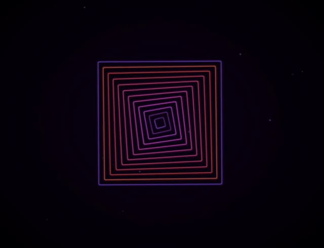
Customizable Loader / Spinner / Transition
62
Cool Blob Effect
38
Zima Blue!
11