
About
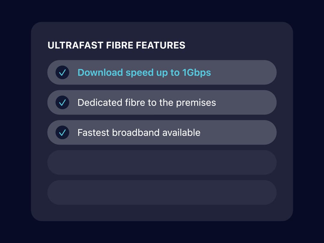
A checklist-style list of plan or product features with checkmark badges, an optional highlighted item, and empty placeholder slots to keep card heights aligned across a pricing/comparison grid.
Built with React and Tailwind. Copy the prompt and paste it into Claude Code, Cursor or Lovable: your agent adds Feature List to your project and fits it to your theme.
Code
How Feature List is used: the demo's code. The component's own source comes with a free account.
Usage.tsx
import { FeatureList } from "@/components/ui/feature-list";

export default function FeatureListDemo() {
  return (
    <div
      className="flex min-h-screen w-full items-center justify-center p-10"
      style={{ backgroundColor: "#080b25" }}
    >
      <div className="w-full max-w-sm rounded-2xl bg-white/10 p-6">
        <FeatureList
          title="ULTRAFAST FIBRE FEATURES"
          maxItems={5}
          features={[
            {
              id: "download-speed",
              label: "Download speed up to 1Gbps",
              highlighted: true,
            },
            {
              id: "dedicated-fibre",
              label: "Dedicated fibre to the premises",
            },
            {
              id: "fastest",
              label: "Fastest broadband available",
            },
          ]}
        />
      </div>
    </div>
  );
}
More by hackdanismo
View all
Section Intro
Card Header
Checkout Header
More in Pricing
View all
Pricing Section
582

Pricing Cards
31

Pricing Card
535

Pricing Section
173
pricing section
158
Single Pricing Card
795

Pricing
125
Glowing Pricing Tiers
45


