
About
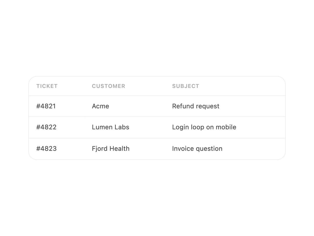
A styled data table that renders column headers and rows of cells, with row-hover highlighting and support for rich cell content like badges or avatars.
Built with React and Tailwind. Copy the prompt and paste it into Claude Code, Cursor or Lovable: your agent adds Table to your project and fits it to your theme.
Code
How Table is used: the demo's code. The component's own source comes with a free account.
Usage.tsx
import Table from "@/components/ui/table";

export default function TableDemo() {
  return (
    <div style={{ width: 480 }}>
      <Table
        columns={["Ticket", "Customer", "Subject"]}
        rows={[
          ["#4821", "Acme", "Refund request"],
          ["#4822", "Lumen Labs", "Login loop on mobile"],
          ["#4823", "Fjord Health", "Invoice question"],
        ]}
      />
    </div>
  );
}
More by halaska-studio
View all
Dot Grid
24
Orb
15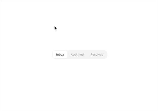
Segmented Control
8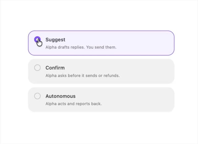
Choicebox
6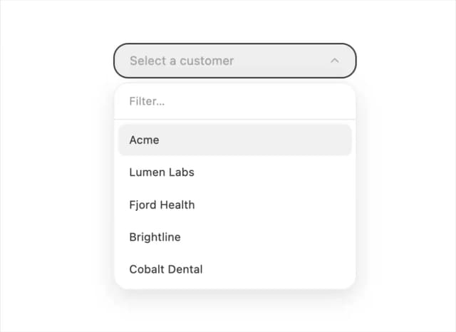
Combobox
5
Dialog
4
Input OTP
4
Switch
1