
About
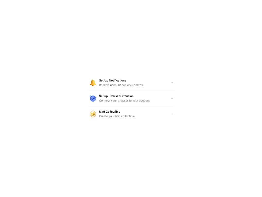
HeroUI v3 Accordion — a collapsible content panel built with the real @heroui/react package. Default and surface variants, single or multiple expanded, controlled and default-expanded keys, custom indicator, disabled items, hidden separators, grouped FAQ layout and custom styles. Works in light and dark themes.
Built with React and Tailwind. Copy the prompt and paste it into Claude Code, Cursor or Lovable: your agent adds HeroUI Accordion to your project and fits it to your theme.
Code
How HeroUI Accordion is used: the demo's code. The component's own source comes with a free account.
Usage.tsx
import { Accordion } from "@/components/ui/heroui-accordion"
import { ChevronDown } from "lucide-react"

const items = [
  { iconUrl: "https://cdn.21st.dev/assets/mirror/f1/f160b971ad232e83567519e272d9dd11468845ad653dbdf2d66e306e4ac80e49.png", title: "Set Up Notifications", subtitle: "Receive account activity updates", content: "Stay informed about your account activity with real-time notifications." },
  { iconUrl: "https://cdn.21st.dev/assets/mirror/24/24998563911cf687e1bb63d35a27b55f9c8d86f6183a38b2a21666c6f7a011a5.png", title: "Set up Browser Extension", subtitle: "Connect your browser to your account", content: "Enhance your browsing experience by installing our official browser extension." },
  { iconUrl: "https://cdn.21st.dev/assets/mirror/e7/e7b9a6f26b454dff5950718064492a4d39cfd3f4d4feba78bda576a567271a25.png", title: "Mint Collectible", subtitle: "Create your first collectible", content: "Begin your journey into the world of digital collectibles by creating your first NFT." },
]

export default function CustomStyles() {
  return (
    <div className="flex min-h-screen w-full items-center justify-center p-8">
      <Accordion variant="surface" className="w-full max-w-md rounded-2xl">
        {items.map((item, i) => (
          <Accordion.Item key={i} className="group/item">
            <Accordion.Heading>
              <Accordion.Trigger className="group flex items-center gap-2">
                <img
                  alt={item.title}
                  src={item.iconUrl}
                  className="h-11 w-11 transition-[scale,rotate] duration-300 ease-out group-hover/item:scale-110 group-hover/item:-rotate-6 group-hover/item:drop-shadow-lg"
                />
                <div className="flex flex-col gap-0 text-left">
                  <span className="font-medium leading-5">{item.title}</span>
                  <span className="font-normal leading-6 text-muted/80">{item.subtitle}</span>
                </div>
                <Accordion.Indicator className="text-muted/50 [&>svg]:size-4">
                  <ChevronDown className="size-4" />
                </Accordion.Indicator>
              </Accordion.Trigger>
            </Accordion.Heading>
            <Accordion.Panel>
              <Accordion.Body className="text-muted/80">{item.content}</Accordion.Body>
            </Accordion.Panel>
          </Accordion.Item>
        ))}
      </Accordion>
    </div>
  )
}
Dependencies
More by Hero Ui
View all

DatePicker
465
Chip
440
The Pagination
361
HeroUI Color Picker
105
Skeleton
104
HeroUI Table
100
HeroUI Disclosure Group
94
HeroUI AlertDialog
80