
About
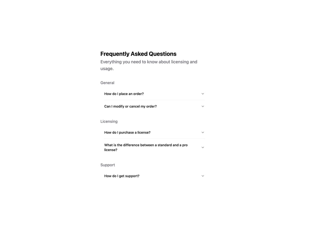
HeroUI v3 Accordion — a collapsible content panel built with the real @heroui/react package. Default and surface variants, single or multiple expanded, controlled and default-expanded keys, custom indicator, disabled items, hidden separators, grouped FAQ layout and custom styles. Works in light and dark themes.
Built with React and Tailwind. Copy the prompt and paste it into Claude Code, Cursor or Lovable: your agent adds HeroUI Accordion to your project and fits it to your theme.
Code
How HeroUI Accordion is used: the demo's code. The component's own source comes with a free account.
Usage.tsx
import { Accordion } from "@/components/ui/heroui-accordion"
import { ChevronDown } from "lucide-react"

const categories = [
  {
    title: "General",
    items: [
      { title: "How do I place an order?", content: "Browse our products, add items to your cart, and proceed to checkout. You'll need to provide shipping and payment information to complete your purchase." },
      { title: "Can I modify or cancel my order?", content: "Yes, you can modify or cancel your order before it's shipped. Once your order is processed, you can't make changes." },
    ],
  },
  {
    title: "Licensing",
    items: [
      { title: "How do I purchase a license?", content: "You can purchase a license directly from our website. Select the license type that fits your needs and proceed to checkout." },
      { title: "What is the difference between a standard and a pro license?", content: "A standard license is for personal use or small projects, while a pro license includes commercial use rights and priority support." },
    ],
  },
  {
    title: "Support",
    items: [
      { title: "How do I get support?", content: "You can reach our support team through the contact form on our website, or email us directly at support@example.com." },
    ],
  },
]

export default function FAQ() {
  return (
    <div className="flex min-h-screen w-full items-center justify-center p-8">
      <div className="flex w-full max-w-md flex-col gap-6">
        <div className="flex flex-col gap-1">
          <h2 className="text-2xl font-bold">Frequently Asked Questions</h2>
          <p className="mb-2 text-lg font-medium text-muted">Everything you need to know about licensing and usage.</p>
        </div>
        {categories.map((category) => (
          <div key={category.title}>
            <p className="mb-2 font-medium text-muted">{category.title}</p>
            <Accordion className="w-full" variant="surface">
              {category.items.map((item, i) => (
                <Accordion.Item key={i}>
                  <Accordion.Heading>
                    <Accordion.Trigger>
                      {item.title}
                      <Accordion.Indicator className="[&>svg]:size-4">
                        <ChevronDown className="size-4" />
                      </Accordion.Indicator>
                    </Accordion.Trigger>
                  </Accordion.Heading>
                  <Accordion.Panel>
                    <Accordion.Body>{item.content}</Accordion.Body>
                  </Accordion.Panel>
                </Accordion.Item>
              ))}
            </Accordion>
          </div>
        ))}
      </div>
    </div>
  )
}
Dependencies
More by Hero Ui
View all

DatePicker
465
Chip
440
The Pagination
361
HeroUI Color Picker
105
Skeleton
104
HeroUI Table
100
HeroUI Disclosure Group
94
HeroUI AlertDialog
80