
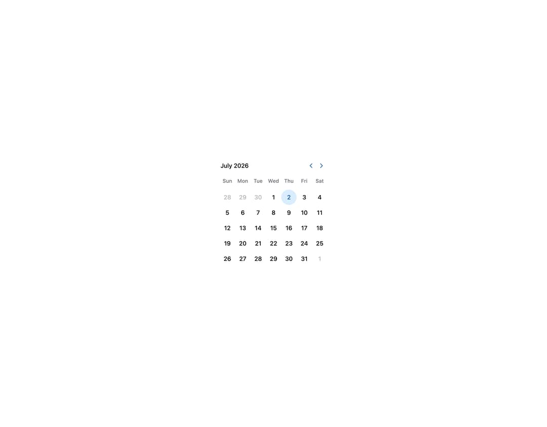
About
HeroUI v3 Calendar — date calendar with year picker, controlled state, week/day views, min/max, unavailable dates, multiple selection, read-only, focused value, cell indicators, multiple months, booking example and custom styles.
Built with React and Tailwind. Copy the prompt and paste it into Claude Code, Cursor or Lovable: your agent adds HeroUI Calendar to your project and fits it to your theme.
Code
How HeroUI Calendar is used: the demo's code. The component's own source comes with a free account.
Usage.tsx
"use client"

import { I18nProvider } from "react-aria-components"

import Calendar from "@/components/ui/heroui-calendar"

export default function Basic() {
  return (
    <I18nProvider locale="en-US">
      <Calendar aria-label="Event date">
        <Calendar.Header>
          <Calendar.Heading />
          <Calendar.NavButton slot="previous" />
          <Calendar.NavButton slot="next" />
        </Calendar.Header>
        <Calendar.Grid>
          <Calendar.GridHeader>
            {(day) => <Calendar.HeaderCell>{day}</Calendar.HeaderCell>}
          </Calendar.GridHeader>
          <Calendar.GridBody>{(date) => <Calendar.Cell date={date} />}</Calendar.GridBody>
        </Calendar.Grid>
      </Calendar>
    </I18nProvider>
  )
}
Dependencies
More by Hero Ui
View all

DatePicker
465
Chip
440
The Pagination
361
HeroUI Color Picker
105
Skeleton
104
HeroUI Table
100
HeroUI Disclosure Group
94
HeroUI AlertDialog
80