
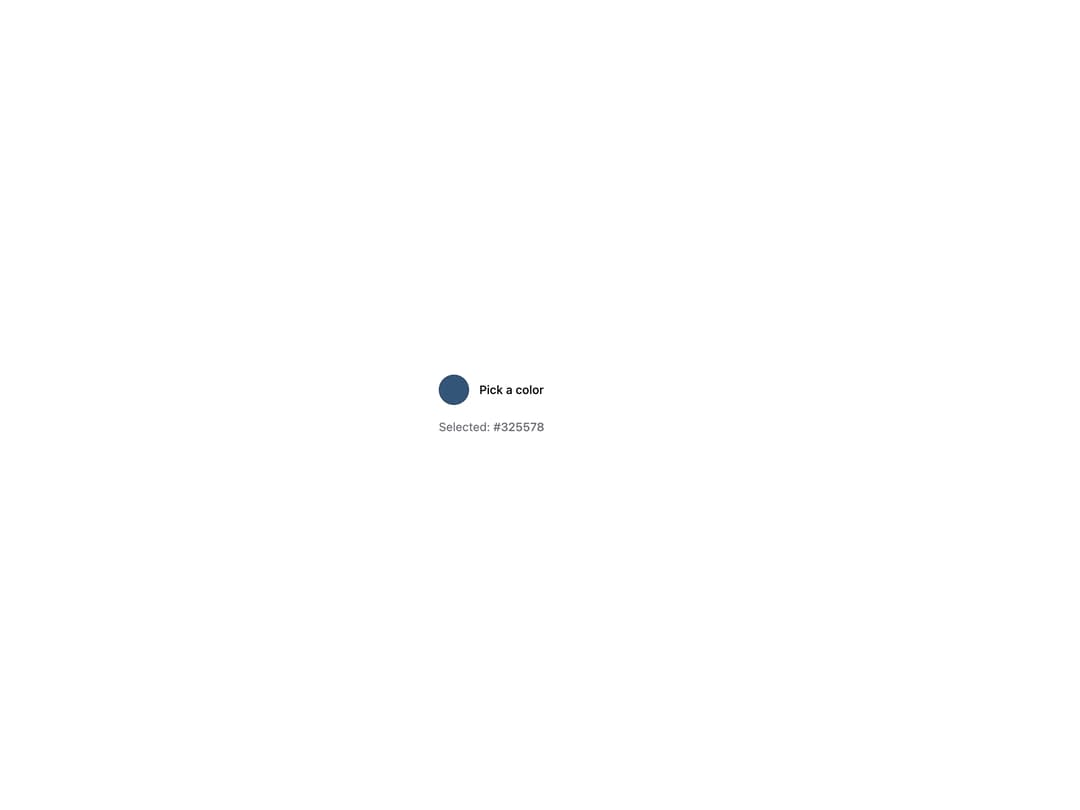
HeroUI v3 ColorPicker is a trigger + popover color picker that composes a swatch trigger with an interactive picker surface — color area, sliders, fields and swatch presets — for selecting a color in any format. Built on the real @heroui/react package with @heroui/styles, it supports controlled and uncontrolled value, editable channel fields, hue/alpha sliders, and preset swatches. A thin re-export of the upstream component so consumers install and render the genuine HeroUI primitive.
Built with React and Tailwind. Copy the prompt and paste it into Claude Code, Cursor or Lovable: your agent adds HeroUI Color Picker to your project and fits it to your theme.
Code
How HeroUI Color Picker is used: the demo's code. The component's own source comes with a free account.
Usage.tsx
"use client"

import { Button, ColorArea, ColorField, ColorSlider, ColorSwatch, ColorSwatchPicker, Label, parseColor } from "@heroui/react"
import { ColorPicker } from "@/components/ui/heroui-color-picker"
import { Shuffle } from "lucide-react"
import {useState} from "react";

export function Controlled() {
  const [color, setColor] = useState(parseColor("#325578"));

  const colorPresets = [
    "#ef4444",
    "#f97316",
    "#eab308",
    "#22c55e",
    "#06b6d4",
    "#3b82f6",
    "#8b5cf6",
    "#ec4899",
    "#f43f5e",
  ];

  const shuffleColor = () => {
    const randomHue = Math.floor(Math.random() * 360);
    const randomSaturation = 50 + Math.floor(Math.random() * 50); // 50-100%
    const randomLightness = 40 + Math.floor(Math.random() * 30); // 40-70%

    setColor(parseColor(`hsl(${randomHue}, ${randomSaturation}%, ${randomLightness}%)`));
  };

  return (
    <div className="flex flex-col gap-4">
      <ColorPicker value={color} onChange={setColor}>
        <ColorPicker.Trigger>
          <ColorSwatch size="lg" />
          <Label>Pick a color</Label>
        </ColorPicker.Trigger>
        <ColorPicker.Popover className="gap-2">
          <ColorSwatchPicker className="justify-center pt-2" size="xs">
            {colorPresets.map((preset) => (
              <ColorSwatchPicker.Item key={preset} color={preset}>
                <ColorSwatchPicker.Swatch />
              </ColorSwatchPicker.Item>
            ))}
          </ColorSwatchPicker>
          <ColorArea
            aria-label="Color area"
            className="max-w-full"
            colorSpace="hsb"
            xChannel="saturation"
            yChannel="brightness"
          >
            <ColorArea.Thumb />
          </ColorArea>
          <div className="flex items-center gap-2 px-1">
            <ColorSlider aria-label="Hue slider" channel="hue" className="flex-1" colorSpace="hsb">
              <ColorSlider.Track>
                <ColorSlider.Thumb />
              </ColorSlider.Track>
            </ColorSlider>
            <Button
              isIconOnly
              aria-label="Shuffle color"
              size="sm"
              variant="tertiary"
              onPress={shuffleColor}
            >
              <Shuffle className="size-4" />
            </Button>
          </div>
          <ColorField aria-label="Color field">
            <ColorField.Group variant="secondary">
              <ColorField.Prefix>
                <ColorSwatch size="xs" />
              </ColorField.Prefix>
              <ColorField.Input />
            </ColorField.Group>
          </ColorField>
        </ColorPicker.Popover>
      </ColorPicker>
      <p className="w-60 text-sm text-muted">
        Selected: <span className="font-medium">{color.toString("hex")}</span>
      </p>
    </div>
  );
}

export default Controlled
Dependencies
More by Hero Ui
View all

DatePicker
465
Chip
440
The Pagination
361
Skeleton
104
HeroUI Table
100
HeroUI Disclosure Group
94
HeroUI AlertDialog
80
ComboBox
75