
About
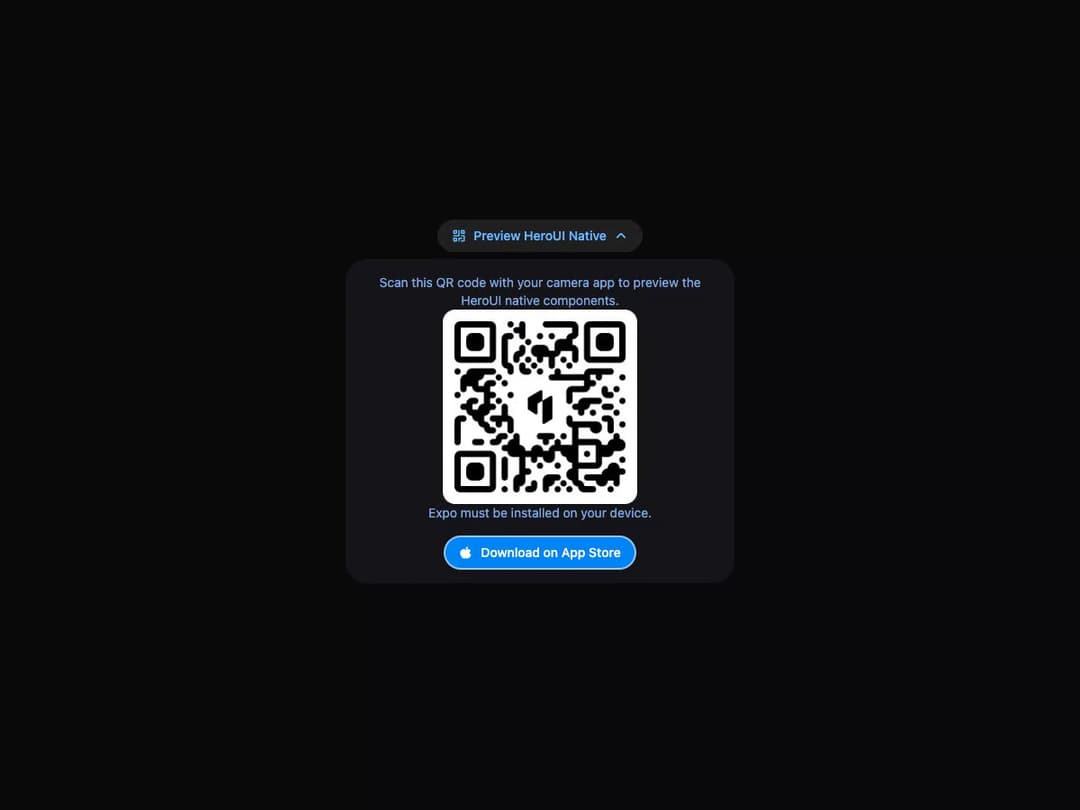
A collapsible section with a header trigger and animated panel content.
Built with React and Tailwind. Copy the prompt and paste it into Claude Code, Cursor or Lovable: your agent adds Disclosure to your project and fits it to your theme.
Code
How Disclosure is used: the demo's code. The component's own source comes with a free account.
Usage.tsx
"use client";

import * as React from "react";

import { Disclosure } from "@/components/ui/heroui-disclosure";

function QrCodeIcon() {
  return (
    <svg xmlns="http://www.w3.org/2000/svg" width="16" height="16" fill="none" viewBox="0 0 16 16">
      <path
        fill="currentColor"
        fillRule="evenodd"
        d="M8.75 2.25a.75.75 0 0 0-1.5 0v5h-5a.75.75 0 0 0 0 1.5h5.5a1 1 0 0 0 1-1zM7.25 11a1 1 0 0 1 1-1H11a.75.75 0 0 1 0 1.5H8.75v2.25a.75.75 0 0 1-1.5 0zM13 13h-2.25a.75.75 0 0 0 0 1.5h2.75a1 1 0 0 0 1-1V8.25a1 1 0 0 0-1-1h-2.75a.75.75 0 0 0 0 1.5H13zM3 4.5V3h1.5v1.5zm-1.5-2a1 1 0 0 1 1-1H5a1 1 0 0 1 1 1V5a1 1 0 0 1-1 1H2.5a1 1 0 0 1-1-1zm1.5 9V13h1.5v-1.5zM2.5 10a1 1 0 0 0-1 1v2.5a1 1 0 0 0 1 1H5a1 1 0 0 0 1-1V11a1 1 0 0 0-1-1zM11.5 3v1.5H13V3zm-1.5-.5a1 1 0 0 1 1-1h2.5a1 1 0 0 1 1 1V5a1 1 0 0 1-1 1H11a1 1 0 0 1-1-1z"
        clipRule="evenodd"
      />
    </svg>
  );
}

function AppleIcon() {
  return (
    <svg
      xmlns="http://www.w3.org/2000/svg"
      xmlnsXlink="http://www.w3.org/1999/xlink"
      aria-hidden="true"
      role="img"
      className="iconify iconify--tabler"
      width="1em"
      height="1em"
      viewBox="0 0 24 24"
    >
      <path
        fill="currentColor"
        d="m15.079 5.999l.239.012c1.43.097 3.434 1.013 4.508 2.586a1 1 0 0 1-.344 1.44c-.05.028-.372.158-.497.217a4 4 0 0 0-.722.431c-.614.461-.948 1.009-.942 1.694c.01.885.339 1.454.907 1.846c.208.143.436.253.666.33c.126.043.426.116.444.122a1 1 0 0 1 .662.942C20 18.24 16.96 22 14.714 22c-.79 0-1.272-.091-1.983-.315l-.098-.031c-.463-.146-.702-.192-1.133-.192c-.52 0-.863.06-1.518.237l-.197.053c-.575.153-.964.226-1.5.248C5.536 22 2 16.907 2 12.438c0-4.12 2.701-6.44 5.604-6.44c.846 0 1.596.242 2.359.705l.303.189c.359.219.53.307.734.307c.168 0 .331-.074.653-.263l.291-.17c.832-.472 1.675-.768 2.896-.768zM14 2a1 1 0 0 1 1 1a3 3 0 0 1-3 3a1 1 0 0 1-1-1a3 3 0 0 1 3-3"
      />
    </svg>
  );
}

function DisclosureDemo() {
  const [isExpanded, setIsExpanded] = React.useState(true);

  return (
    <div className="flex min-h-screen w-full items-center justify-center overflow-hidden bg-background p-8 text-foreground">
      <style>{`
        :root {
          --background: 240 5% 96%;
          --foreground: 240 10% 3.9%;
          --surface: 0 0% 100%;
          --muted: lab(47.8738 1.41454 -4.98644);
          --primary: oklab(0.497363 -0.0375369 -0.132786);
          --primary-button: lab(54.5335 3.31545 -66.5298);
          --secondary-bg: lab(93.0314 0.0993609 -0.364041);
          --panel-shadow: none;
        }

        .dark {
          --background: 240 10% 3.9%;
          --foreground: 0 0% 98%;
          --surface: 240 8% 9%;
          --muted: oklab(0.724755 -0.0256654 -0.0990053);
          --primary: oklab(0.781592 -0.0475363 -0.16033);
          --primary-button: oklab(0.62 -0.055 -0.188);
          --secondary-bg: oklab(0.245 0 0);
          --panel-shadow: none;
        }

        .bg-background { background-color: hsl(var(--background)); }
        .text-foreground { color: hsl(var(--foreground)); }
        .demo-card { width: 100%; max-width: 28rem; text-align: center; }
        .button {
          box-sizing: border-box;
          display: inline-flex;
          height: 36px;
          align-items: center;
          justify-content: center;
          gap: 8px;
          border: 0;
          border-radius: 24px;
          padding: 0 16px;
          font-size: 14px;
          font-weight: 500;
          line-height: 20px;
          white-space: nowrap;
          color: var(--primary);
          background: var(--secondary-bg);
        }
        .button--primary {
          color: white;
          background: var(--primary-button);
        }
        .button svg {
          width: 16px;
          height: 16px;
          flex: none;
        }
        .disclosure__heading {
          justify-content: center;
        }
        .native-panel {
          display: flex;
          flex-direction: column;
          align-items: center;
          border-radius: 24px;
          background: hsl(var(--surface));
          padding: 16px;
          text-align: center;
          box-shadow: var(--panel-shadow);
        }
        .native-panel p {
          margin: 0;
          color: var(--muted);
          font-size: 14px;
          line-height: 20px;
        }
        .native-panel img {
          aspect-ratio: 1 / 1;
          width: 100%;
          max-width: 216px;
          object-fit: cover;
        }
        .app-store-button {
          margin-top: 16px;
        }
      `}</style>

      <div className="demo-card">
        <Disclosure isExpanded={isExpanded} onExpandedChange={setIsExpanded}>
          <Disclosure.Heading>
            <Disclosure.Trigger className="button button--secondary">
              <QrCodeIcon />
              Preview HeroUI Native
              <Disclosure.Indicator />
            </Disclosure.Trigger>
          </Disclosure.Heading>
          <Disclosure.Content>
            <Disclosure.Body className="native-panel">
              <p>Scan this QR code with your camera app to preview the HeroUI native components.</p>
              <img
                alt="Expo Go QR Code"
                src="https://cdn.21st.dev/assets/mirror/4b/4b5f6e9f007d19d8c00dd42389505309ae3619e4756d669340d91cf6eb5f4448.png"
              />
              <p>Expo must be installed on your device.</p>
              <button className="button button--primary app-store-button" type="button">
                <AppleIcon />
                Download on App Store
              </button>
            </Disclosure.Body>
          </Disclosure.Content>
        </Disclosure>
      </div>
    </div>
  );
}

export default function Default() {
  return <DisclosureDemo />;
}

export { DisclosureDemo };
More by Hero Ui
View all

DatePicker
465
Chip
440
The Pagination
361
HeroUI Color Picker
105
Skeleton
104
HeroUI Table
100
HeroUI Disclosure Group
94
HeroUI AlertDialog
80