
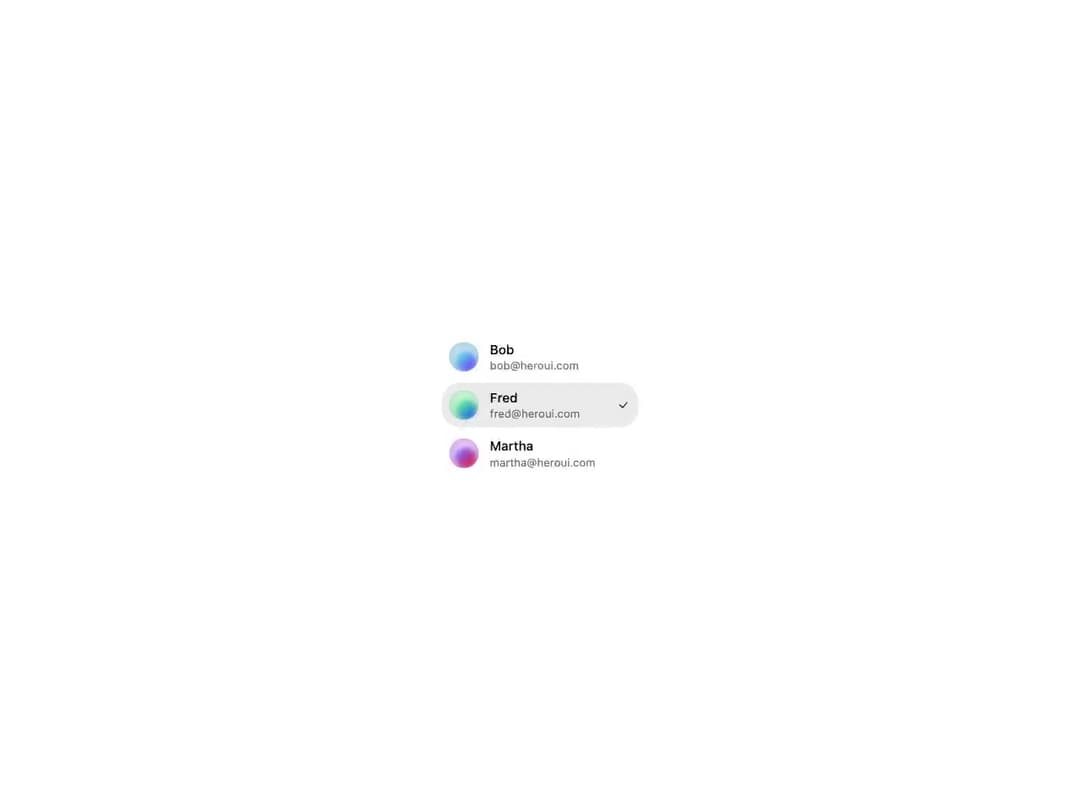
HeroUI v3 ListBox — an accessible, keyboard-navigable list of selectable options with single and multiple selection, sections with headers, per-item labels, descriptions, avatars and keyboard-shortcut hints, disabled items, custom selection indicators, controlled selection state, custom render functions, and windowed virtualization for large datasets. A thin re-export of the genuine @heroui/react package with @heroui/styles, so consumers install and render the real HeroUI primitive.
Built with React and Tailwind. Copy the prompt and paste it into Claude Code, Cursor or Lovable: your agent adds HeroUI ListBox to your project and fits it to your theme.
Code
How HeroUI ListBox is used: the demo's code. The component's own source comes with a free account.
Usage.tsx
"use client"

import {
  Avatar,
  Description,
  Label,
  ListBox,
} from "@/components/ui/heroui-list-box"

export default function CustomRenderFunction() {
  return (
    <ListBox
      aria-label="Users"
      className="w-[220px]"
      render={(props) => <div {...props} data-custom="true" />}
      selectionMode="single"
    >
      <ListBox.Item
        id="1"
        render={(props) => <span {...props} data-custom="foo" />}
        textValue="Bob"
      >
        <Avatar size="sm">
          <Avatar.Image
            alt="Bob"
            src="https://cdn.21st.dev/assets/mirror/de/defa32ddb23b6307c5cb8d701022186645dfcee057d2b0ba9ec1955dea22db70.jpg"
          />
          <Avatar.Fallback>B</Avatar.Fallback>
        </Avatar>
        <div className="flex flex-col">
          <Label>Bob</Label>
          <Description>bob@heroui.com</Description>
        </div>
        <ListBox.ItemIndicator />
      </ListBox.Item>
      <ListBox.Item
        id="2"
        render={(props) => <span {...props} data-custom="bar" />}
        textValue="Fred"
      >
        <Avatar size="sm">
          <Avatar.Image
            alt="Fred"
            src="https://cdn.21st.dev/assets/mirror/c4/c48cdbaa2058ca5420edd44e17537d7f2cbaab72f5ae01e5738fa82f3d090ba1.jpg"
          />
          <Avatar.Fallback>F</Avatar.Fallback>
        </Avatar>
        <div className="flex flex-col">
          <Label>Fred</Label>
          <Description>fred@heroui.com</Description>
        </div>
        <ListBox.ItemIndicator />
      </ListBox.Item>
      <ListBox.Item
        id="3"
        render={(props) => <span {...props} data-custom="baz" />}
        textValue="Martha"
      >
        <Avatar size="sm">
          <Avatar.Image
            alt="Martha"
            src="https://cdn.21st.dev/assets/mirror/df/dfed184450806d7a0a9d72c650f73979ae15b522cb8e65fade232bb5ec55ca72.jpg"
          />
          <Avatar.Fallback>M</Avatar.Fallback>
        </Avatar>
        <div className="flex flex-col">
          <Label>Martha</Label>
          <Description>martha@heroui.com</Description>
        </div>
        <ListBox.ItemIndicator />
      </ListBox.Item>
    </ListBox>
  )
}
Dependencies
More by Hero Ui
View all

DatePicker
465
Chip
440
The Pagination
361
HeroUI Color Picker
105
Skeleton
104
HeroUI Table
100
HeroUI Disclosure Group
94
HeroUI AlertDialog
80