
About
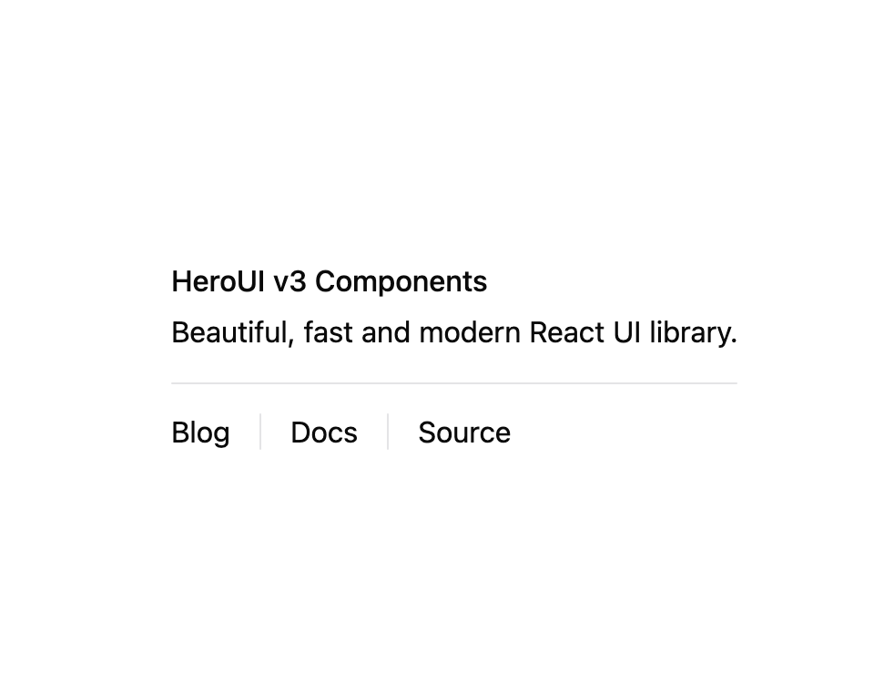
HeroUI v3 Separator — horizontal/vertical divider with content, variants, on-surface usage and a custom render-function API.
Built with React and Tailwind. Copy the prompt and paste it into Claude Code, Cursor or Lovable: your agent adds HeroUI Separator to your project and fits it to your theme.
Code
How HeroUI Separator is used: the demo's code. The component's own source comes with a free account.
Usage.tsx
"use client"

import { Separator } from "@/components/ui/heroui-separator"

export default function CustomRenderFunction() {
  return (
    <div className="max-w-md">
      <div className="space-y-1">
        <h4 className="text-medium font-medium">HeroUI v3 Components</h4>
        <p className="text-small text-default-400">Beautiful, fast and modern React UI library.</p>
      </div>
      <Separator className="my-4" render={(props) => <div {...props} data-custom="foo" />} />
      <div className="text-small flex h-5 items-center space-x-4">
        <div>Blog</div>
        <Separator
          orientation="vertical"
          render={(props) => <div {...props} data-custom="foo" />}
        />
        <div>Docs</div>
        <Separator
          orientation="vertical"
          render={(props) => <div {...props} data-custom="foo" />}
        />
        <div>Source</div>
      </div>
    </div>
  )
}
Dependencies
More by Hero Ui
View all

DatePicker
465
Chip
440
The Pagination
361
HeroUI Color Picker
105
Skeleton
104
HeroUI Table
100
HeroUI Disclosure Group
94
HeroUI AlertDialog
80